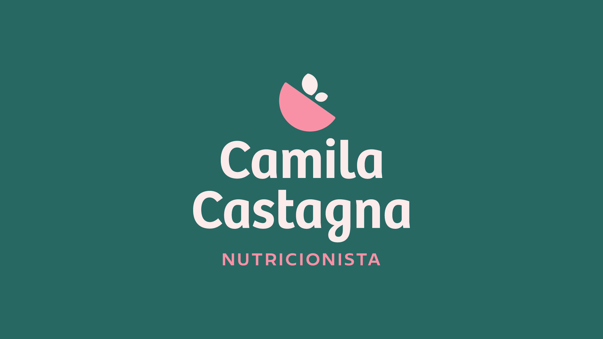
Camila Castagna é uma nutricionista da cidade de Cambará do Sul, RS que tem como foco a nutrição comportamental e funcional.
Objetivos do projeto:
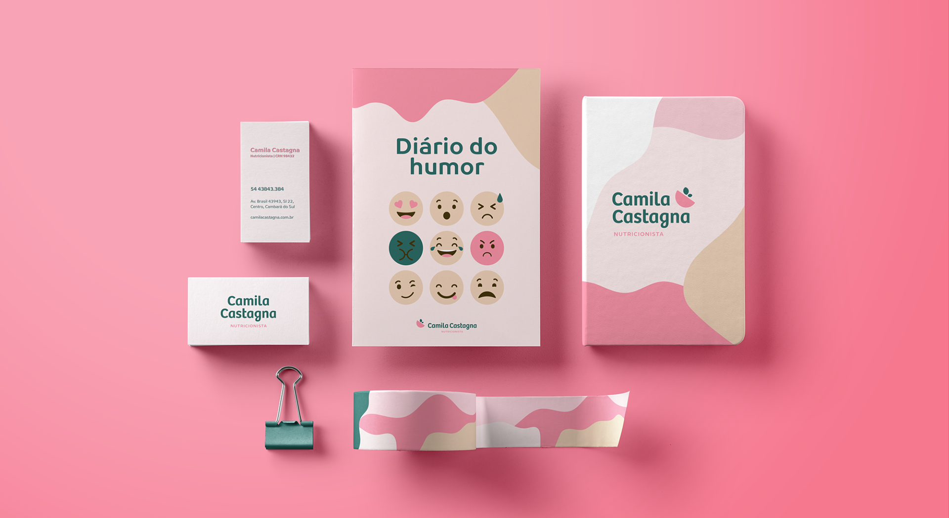
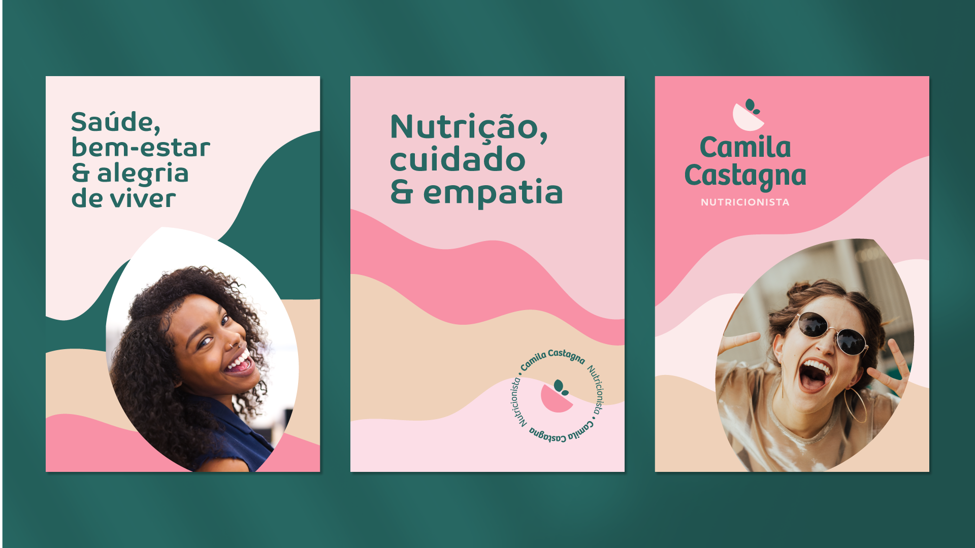
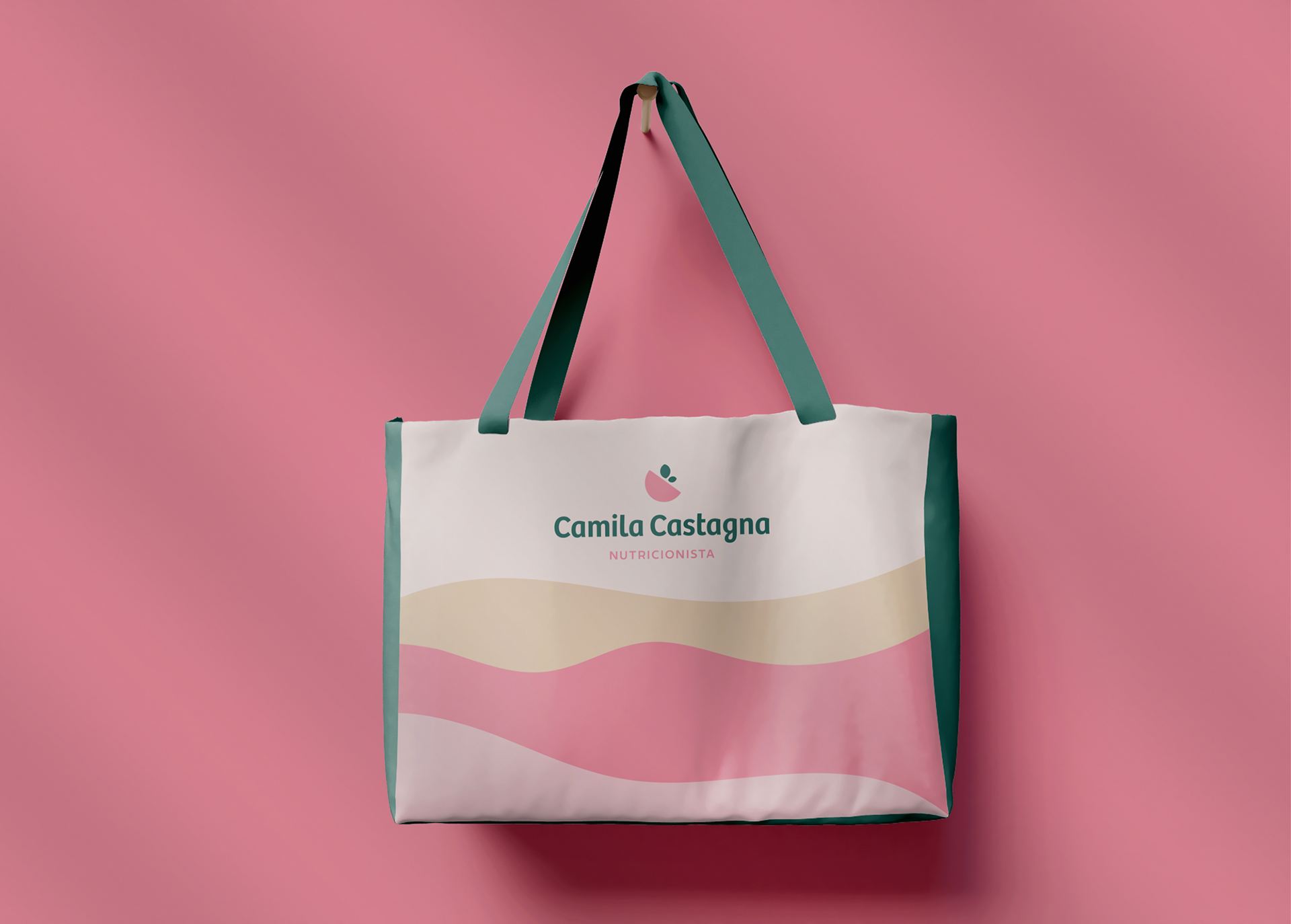
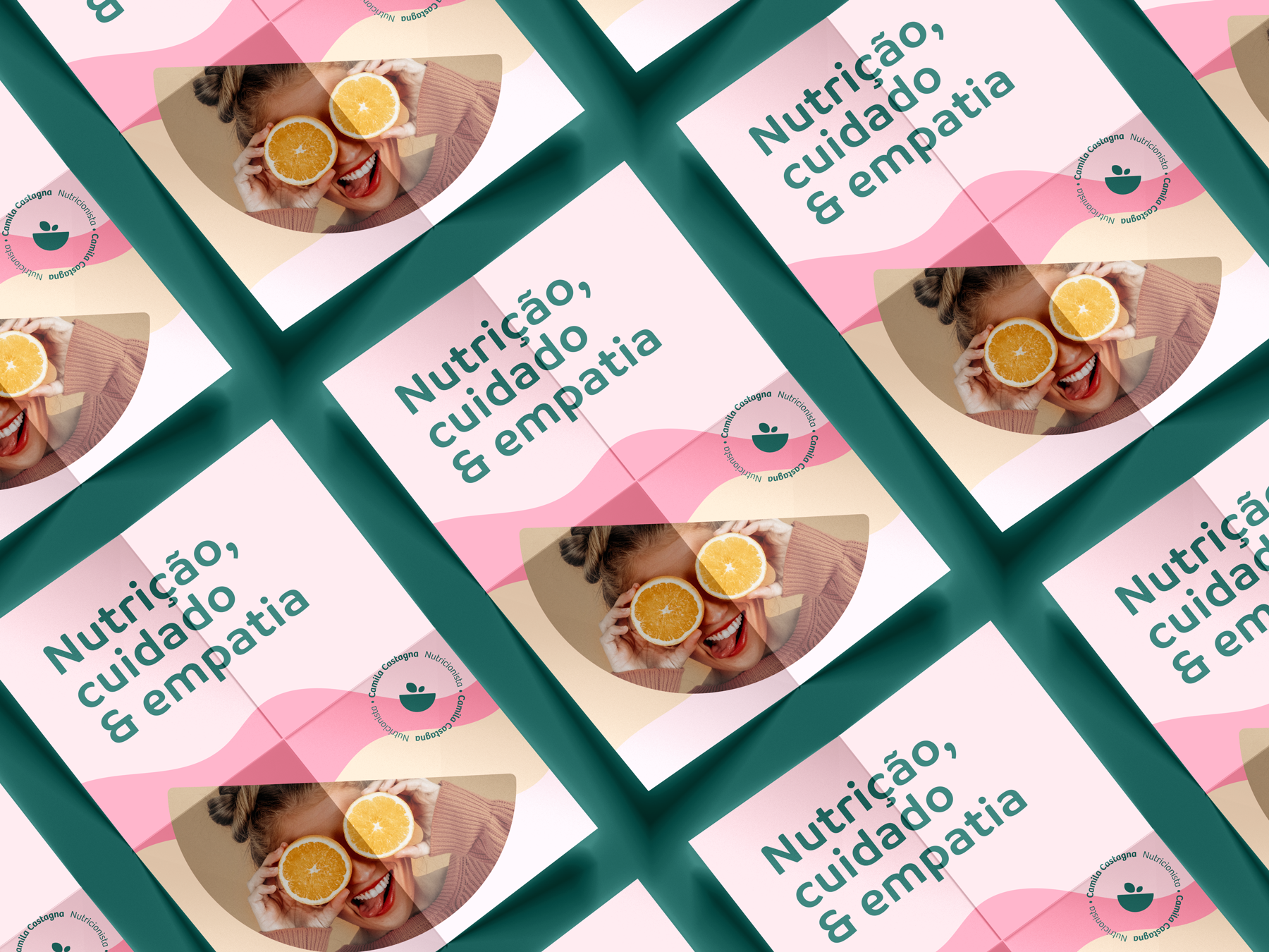
- Representar os atributos: amigável, extrovertida, aconchegante, delicada, orgânica, próxima, leve e discreta.
- Fugir do óbvio: não utilizar maçã e fita métrica. São elementos muito clichês da área.
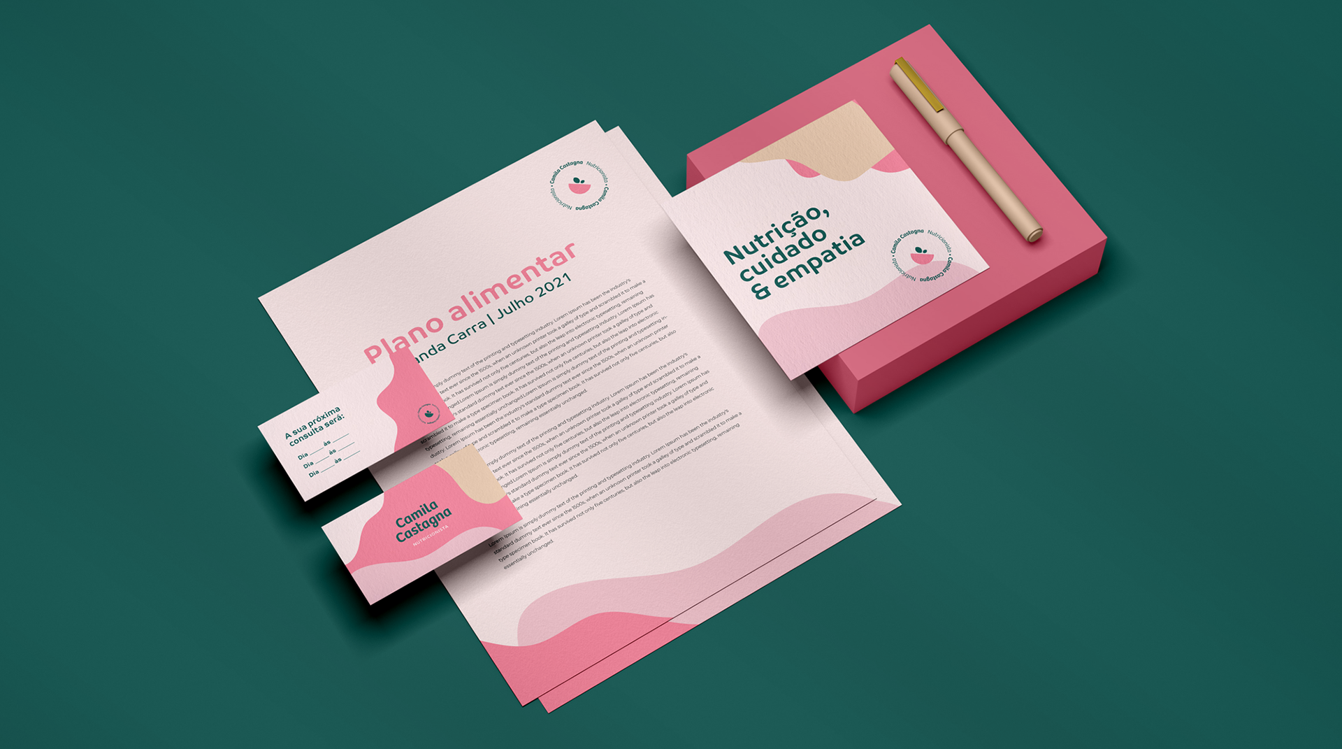
- Ser flexível: para aplicação no canva, word, para impressão e meio online.
- Comunicar com o público: mulheres jovens que buscam emagrecer.
- Harmonizar com o espaço físico.
-
Camila Castagna is a Brazilian nutritionist who focuses on behavioral and functional nutrition.
Project goals:
- Represent the attributes: friendly, outgoing, cozy, delicate, organic and acessible
- Avoid the obvious: do not use apples and measuring tapes. They are very clichéd elements of the area. -
Be flexible: for application on canvas, word, for print and online.
- Communicate with the public: young women looking to lose weight.
- Harmonize with the clinic.
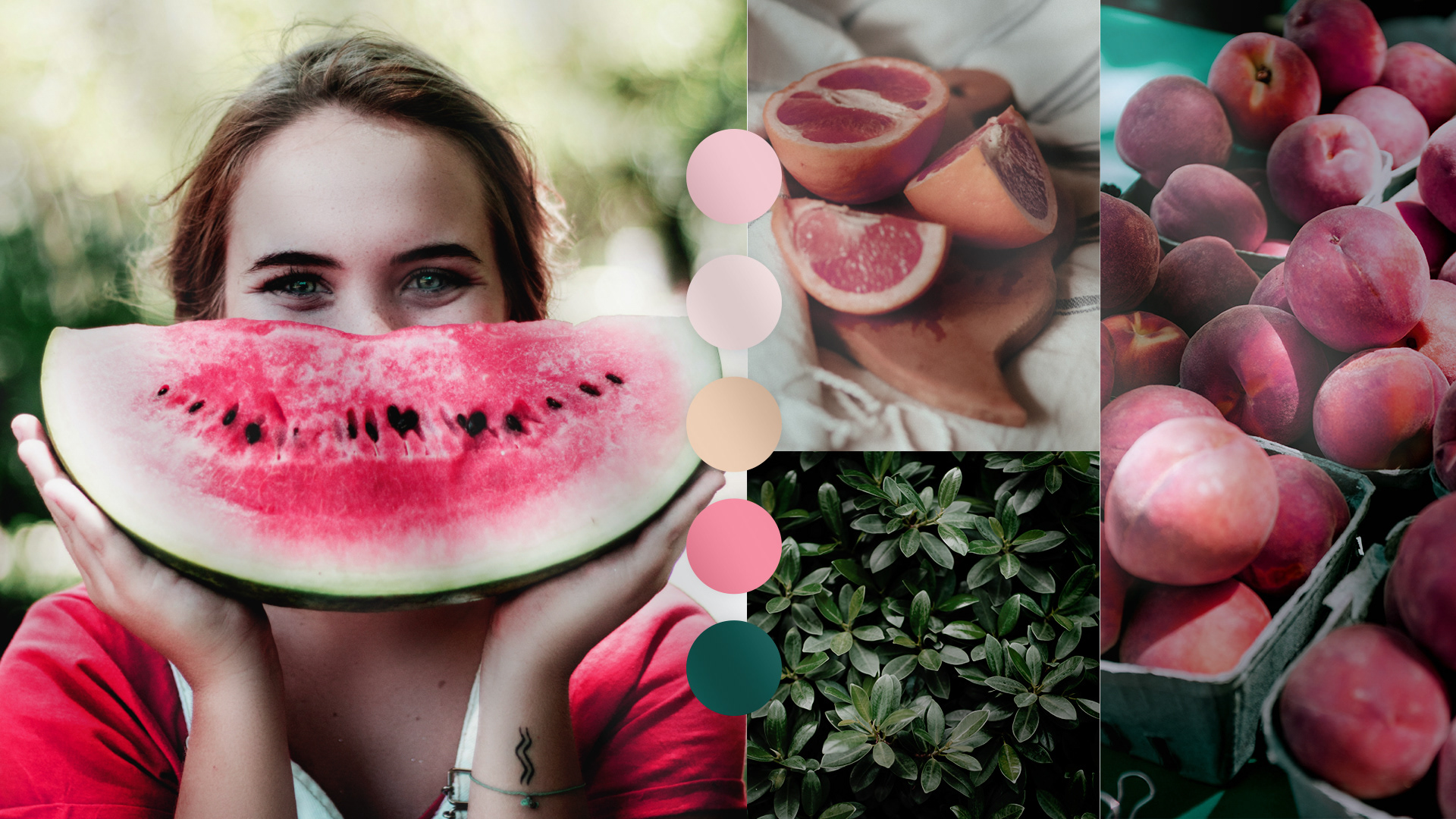
As cores
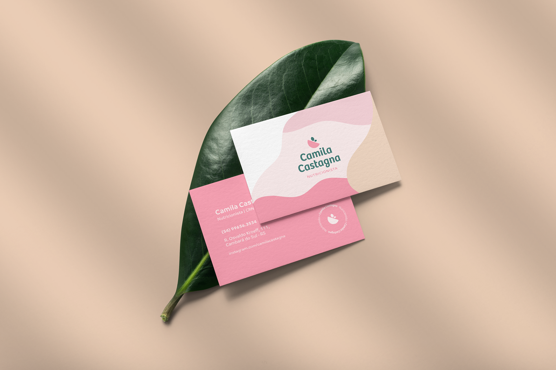
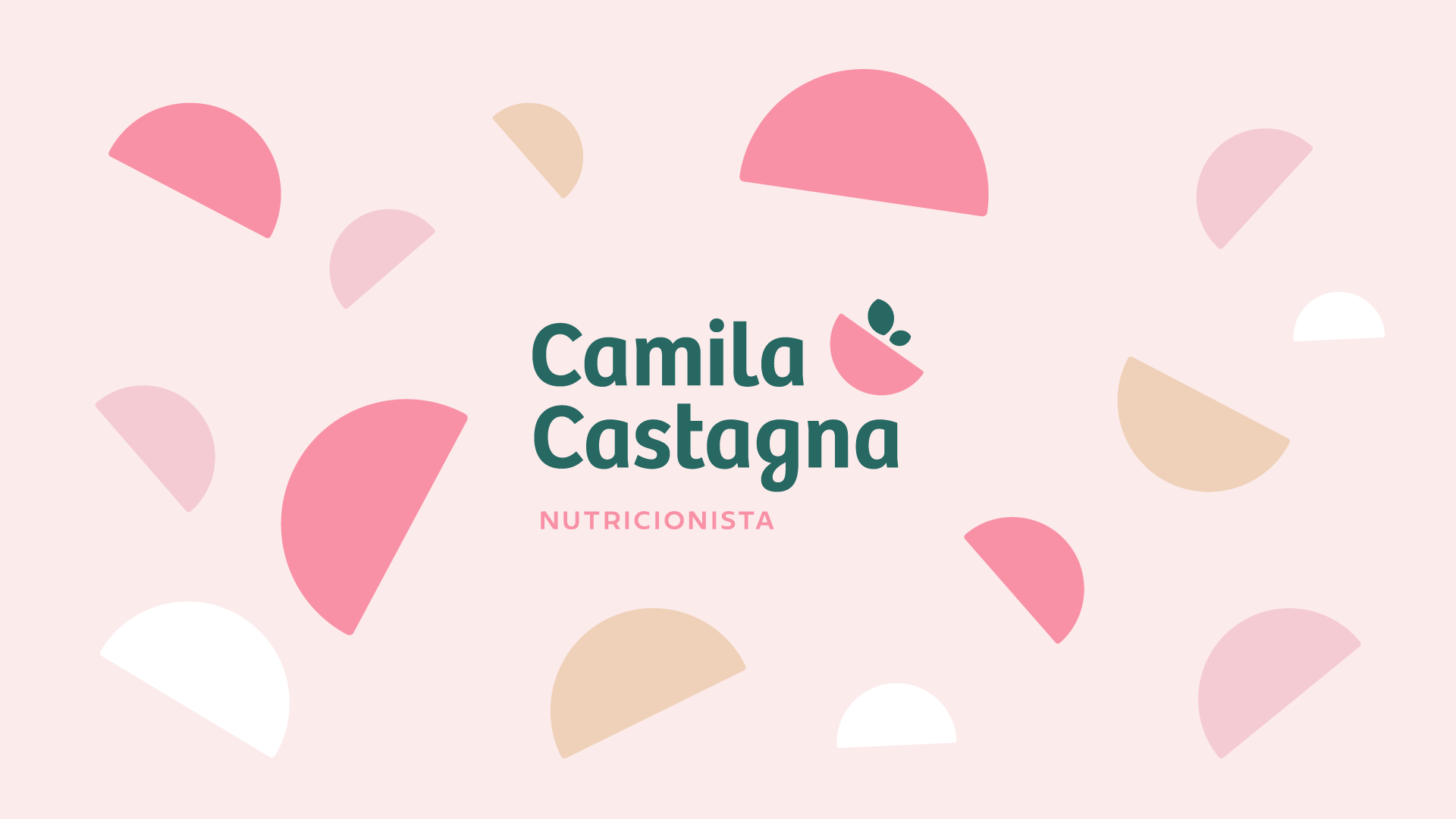
As cores escolhidas adicionam uma atmosfera alegre, extrovertida, leve e aconchegante que se conectam diretamente com o público alvo.
Os tons de rosa trazem delicadeza, feminilidade e acolhimento para a marca, além de harmonizarem com a mobília.
Já o verde escuro promove a sensação de saudável, orgânico, sóbrio e confiável. Apesar de ser verde, esse tom se diferencia dos outros players do mercado.
O tom de bege traz o aconchego e faz a união das cores ser ainda mais harmônica e agradável.
-
The colors
The chosen colors add a cheerful, extroverted, light and cozy atmosphere that connects directly with the target audience. The shades of pink bring delicacy, femininity and warmth to the brand, in addition to harmonizing with the furniture. Dark green, on the other hand, promotes the feeling of being healthy, organic, sober and confident. Despite being green, this tone is different from other players in the market. The beige tone brings warmth and makes the combination of colors even more harmonious and pleasant.
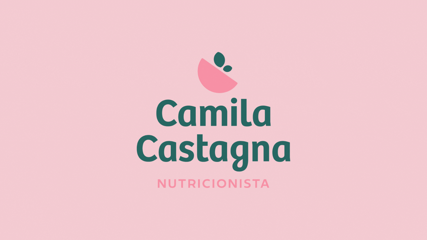
O símbolo
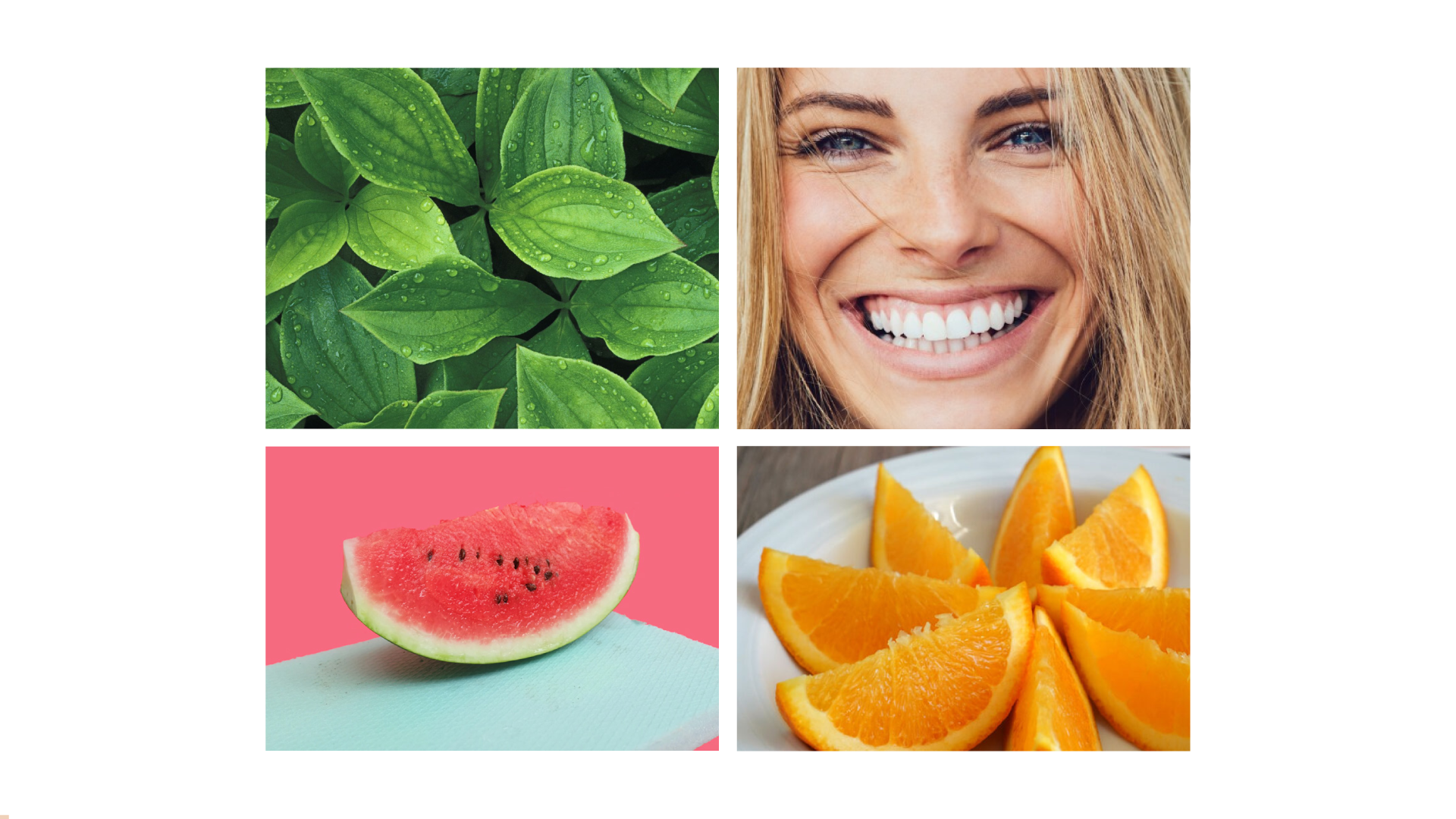
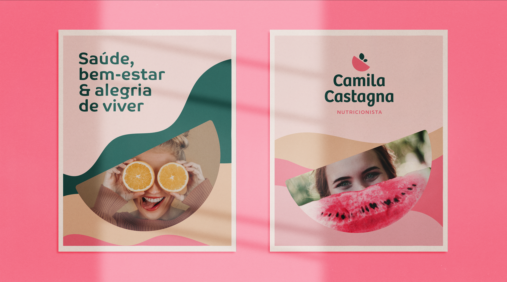
O processo de nutrição é um dos fatores mais importantes para manter as funções do organismo em dia em todas as fases da nossa vida. Levando esses fatores em consideração para transmitir a essência da marca foi escolhida como simbolismo a folha que está diretamente ligada à árvore, e representa a vida, ciclo, mudança e crescimento. Além de representar o saudável e orgânico.
O sorriso de satisfação e alegria pela autoestima, bem-estar, saúde e qualidade de vida elevados devido à alimentação é inerente ao paciente. Assim como a fruta, essencial para a nutrição do nosso corpo também foram representados. Tudo de forma leve, divertida, orgânica e alegre.
-
The symbol
The nutrition process is one of the most important factors in keeping the body's functions up to date at all stages of our lives. Taking these factors into account to convey the essence of the brand, the leaf that is directly linked to the tree was chosen as symbolism and represents life, cycle, change and growth. In addition, it represents the healthy and organic. The smile of satisfaction and joy due to high self-esteem, well-being, health and quality of life due to nutrition is inherent to the patient. As well as a fruit, essential for our body's nutrition were also represented. Everything in a light, fun, organic and happy way.


Thanks!