
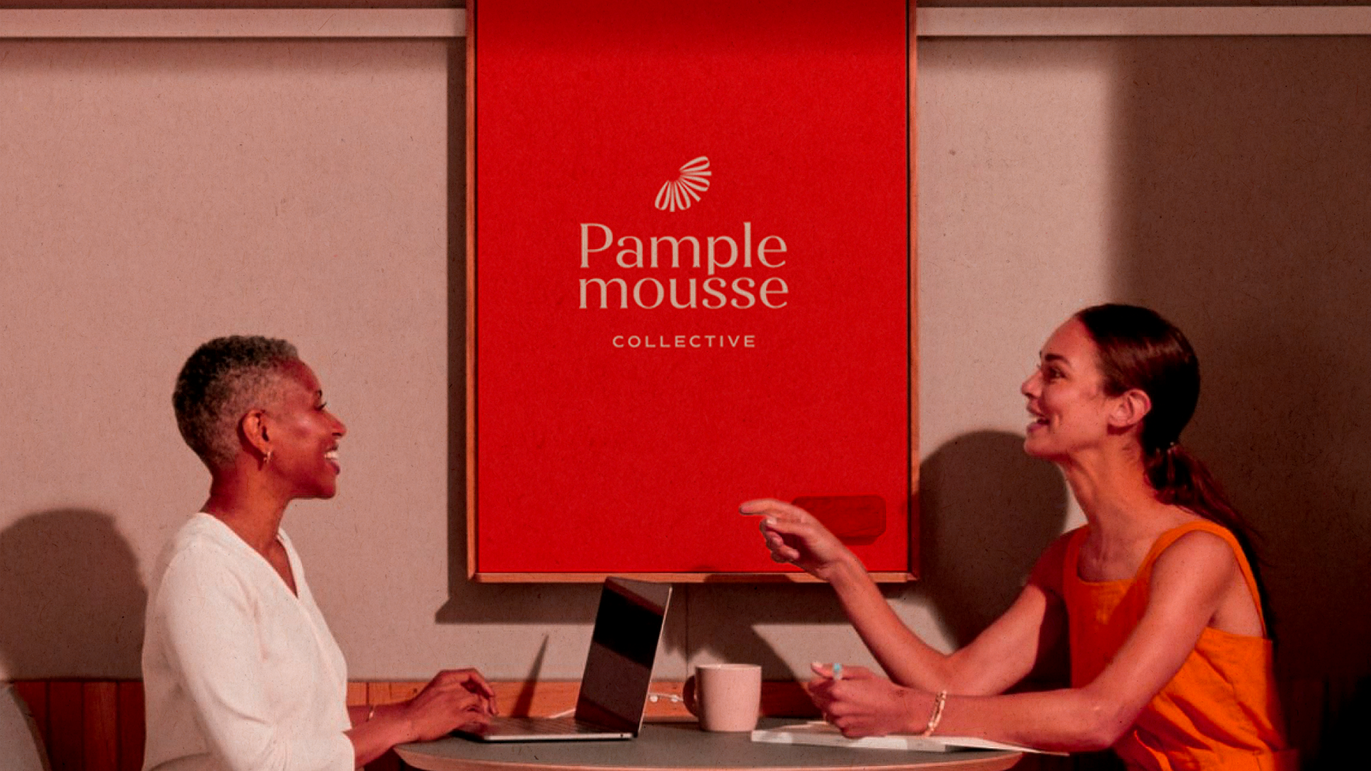
About the brand:
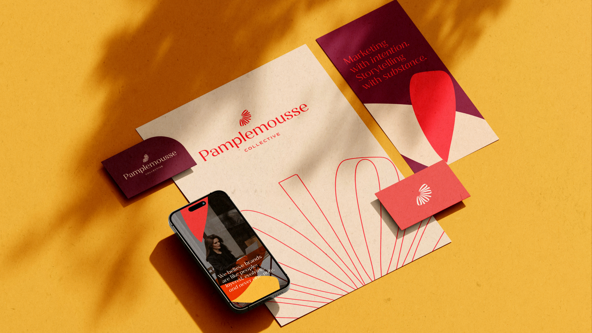
Pamplemousse Collective is a boutique digital marketing agency specializing in working with expat service providers in Western Europe. Founded by a US expat living in France, the agency evolved from Naughton Writing and Consulting (est. 2021) into a purposeful marketing partner that understands both the American expat experience and the unique challenges of marketing professional services across cultures.
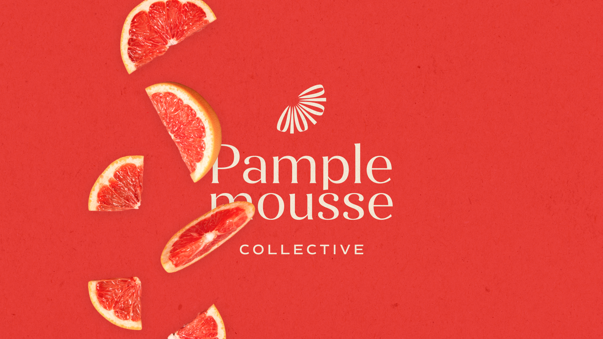
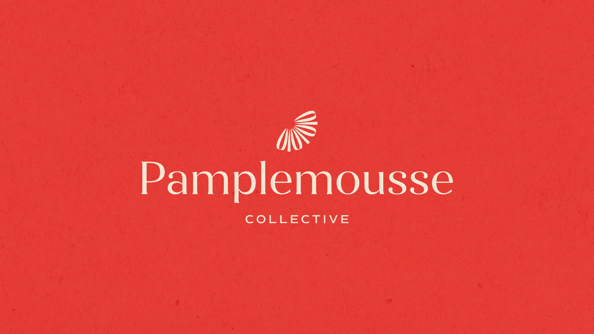
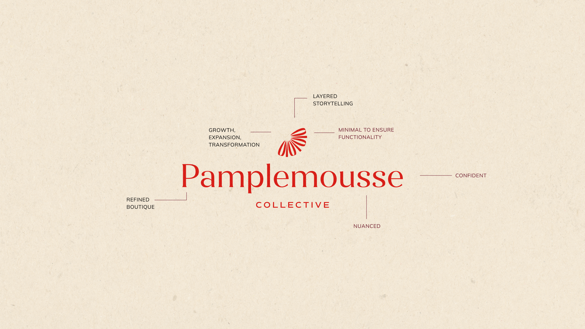
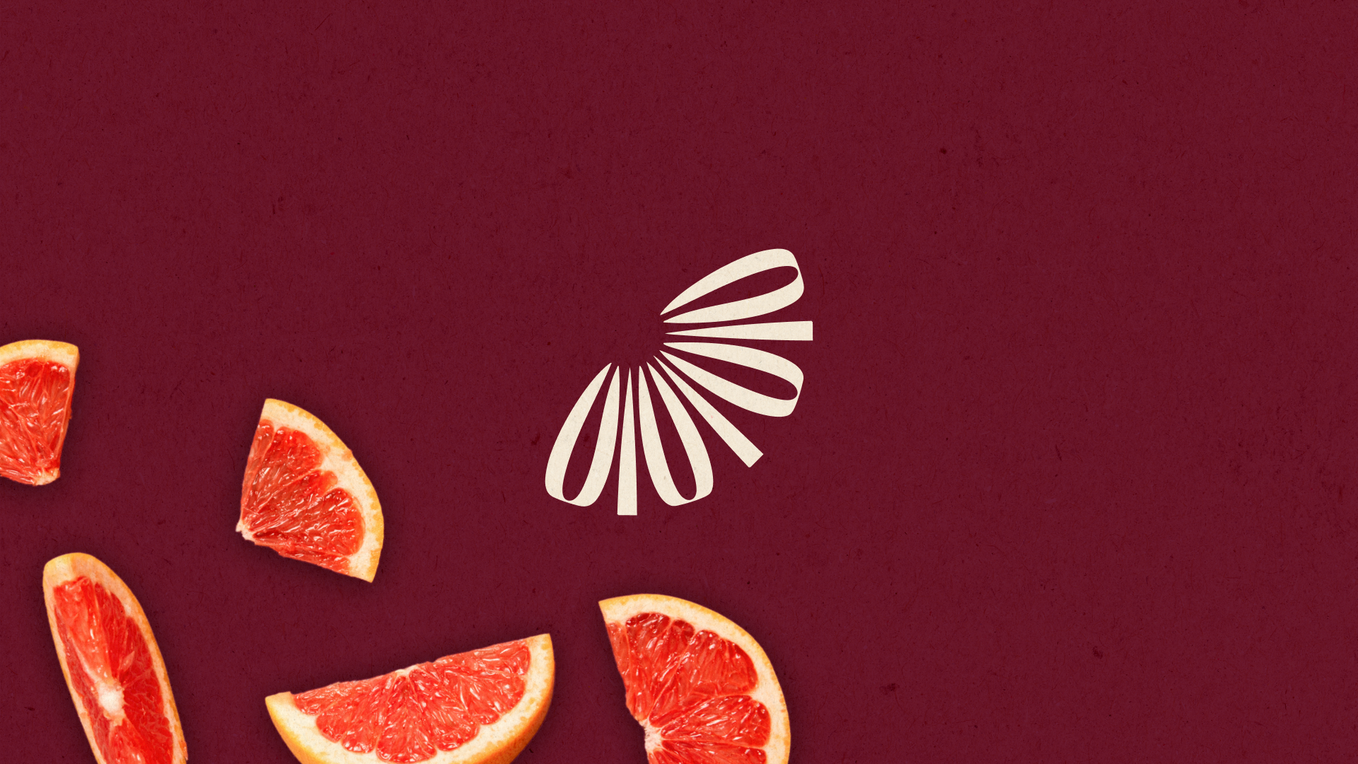
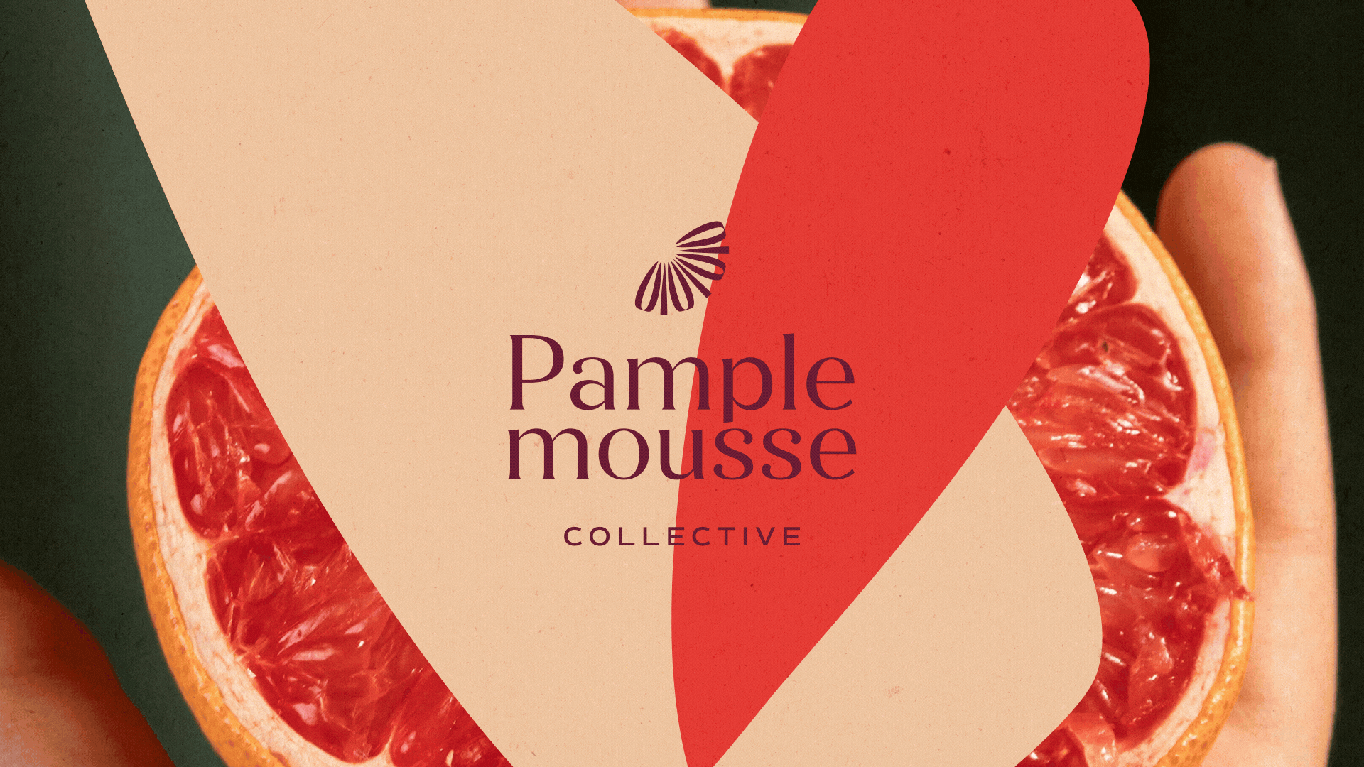
The name "Pamplemousse" (French for grapefruit) represents the founder's personal journey, it was the first French word she learned before moving to France, symbolizing how life can surprise you with its sweet and sour moments, much like the complex flavors of a grapefruit.
For the client, Pamplemousse isn’t random. It carries layers: personal, cultural, and symbolic, just like the way you approach marketing.
Our goal was to build an identity that reflects that origin while giving you the presence of a boutique agency ready for its next chapter.
Our goal was to build an identity that reflects that origin while giving you the presence of a boutique agency ready for its next chapter.
The design challenges:
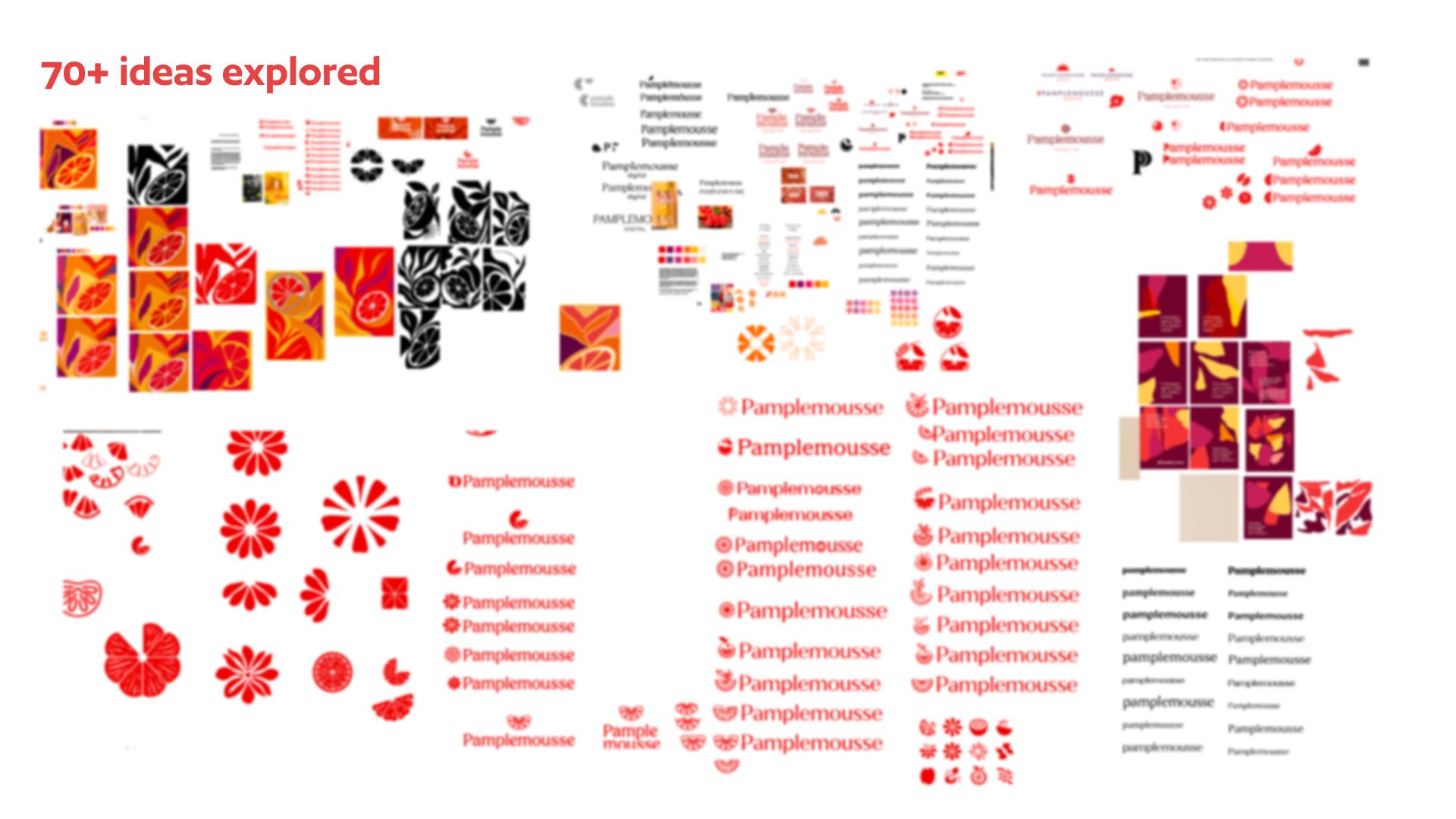
How do we reference the grapefruit without looking like a juice brand?
How do we bring in color without drifting into something too vibrant or “girly”?
How do we keep it human and personal, but still professional and confident?
How do we design visuals that feel as thoughtful and layered as the way the founder writes?
Looking like a grapefruit, but not so obvious it feels cliché, and not too abstract you can’t recognize the reference.
Being feminine and approachable, but not overly feminine, since the male audience is equally important.
Avoiding a vintage aesthetic, while also steering clear of the tech-bro vibe of neon or corporate minimalism.
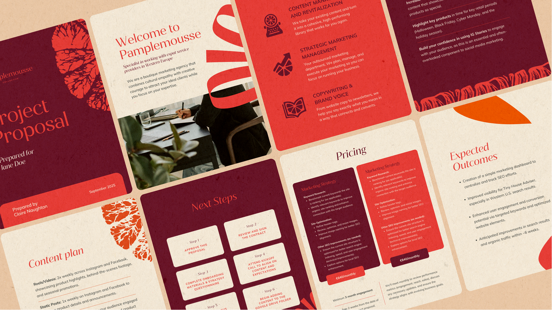
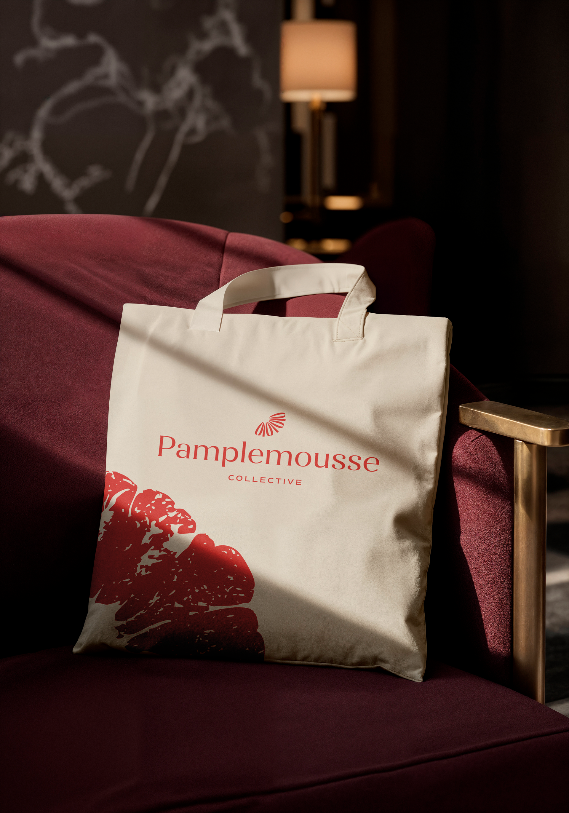
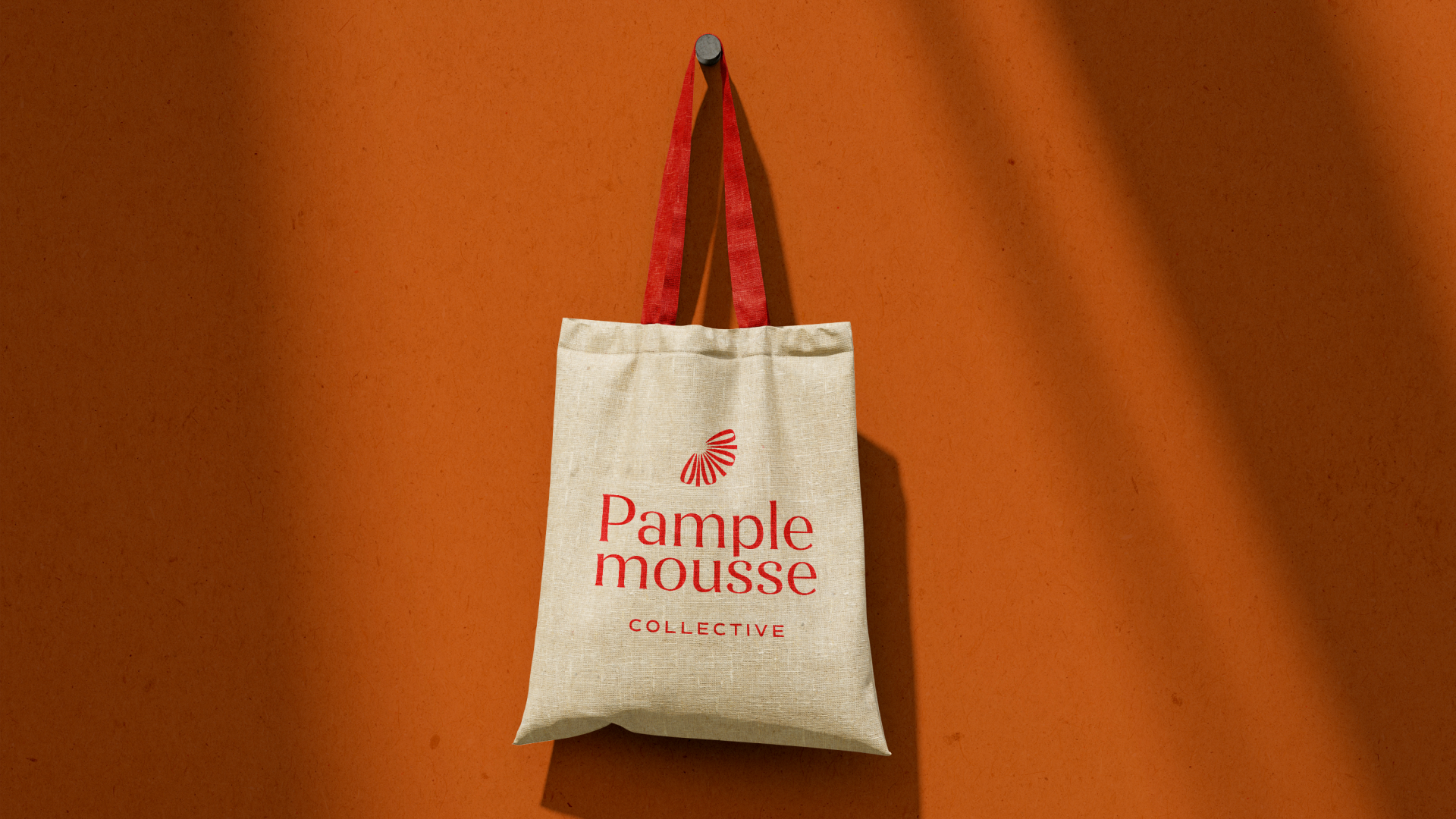
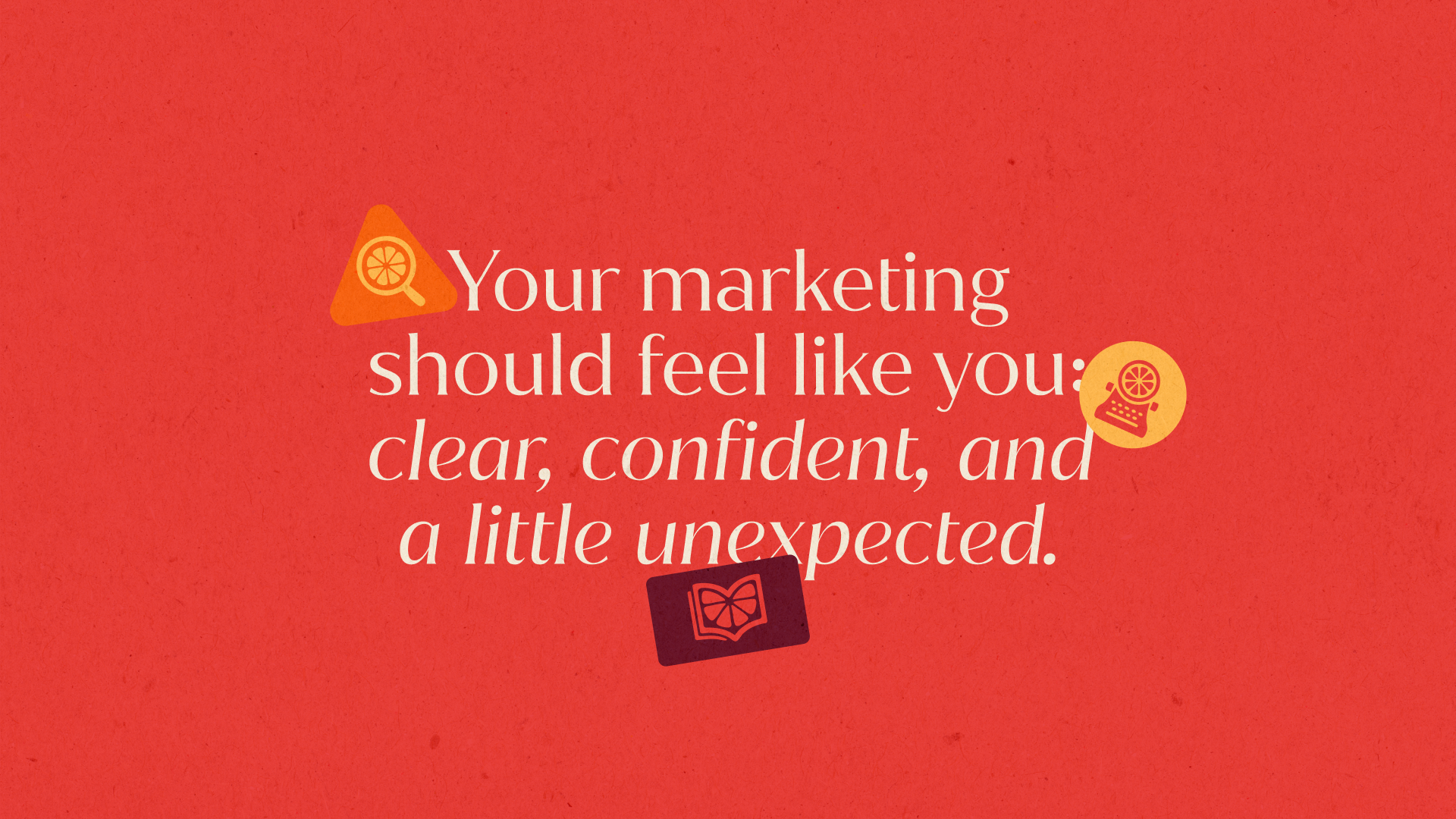
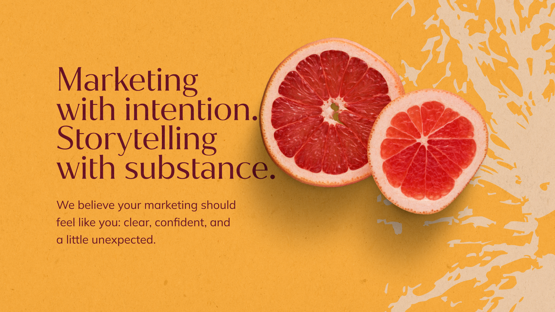
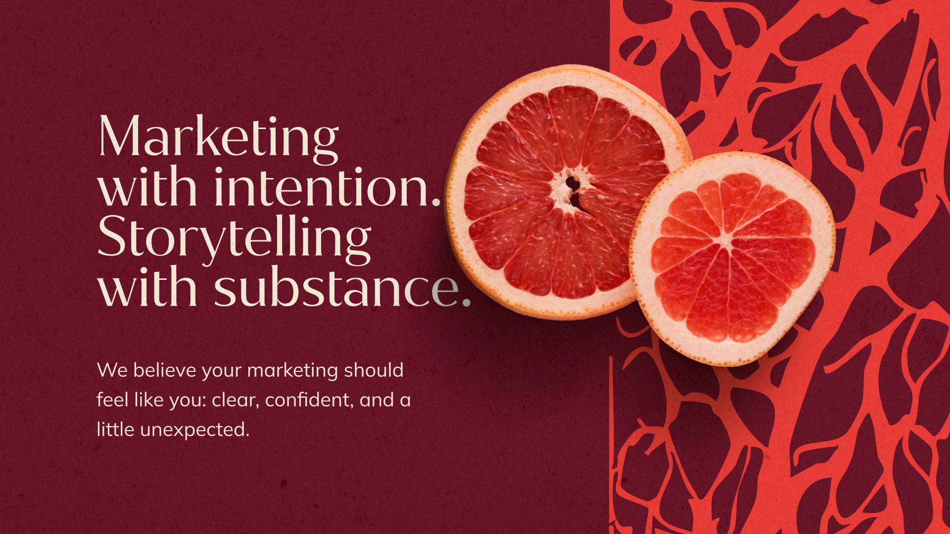
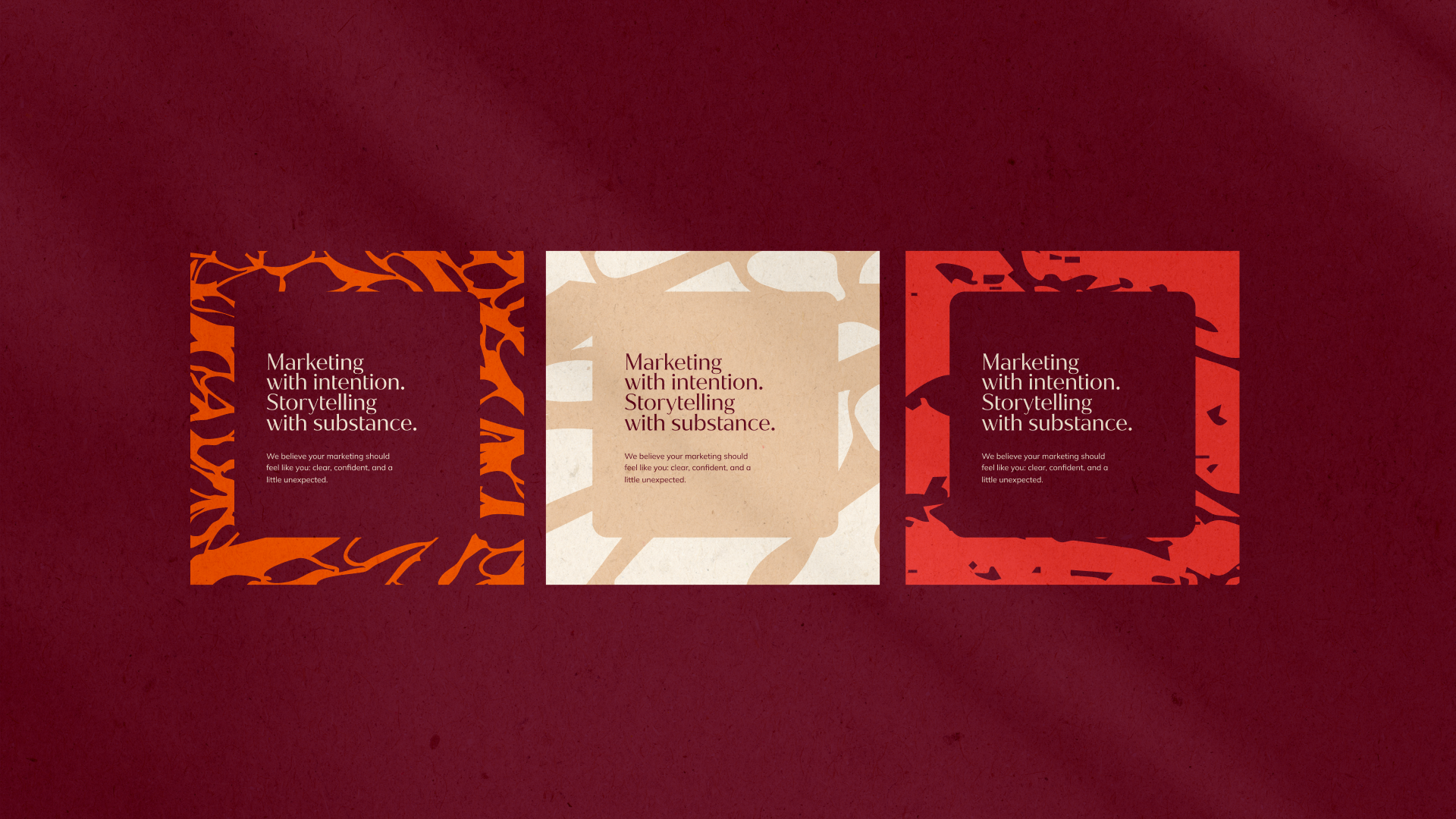
Pamplemousse Collective is a boutique agency that bridges cultures and voices. Its identity reflects layered storytelling, refined confidence, and a touch of bold creativity: a brand that feels human, approachable, and specialized.
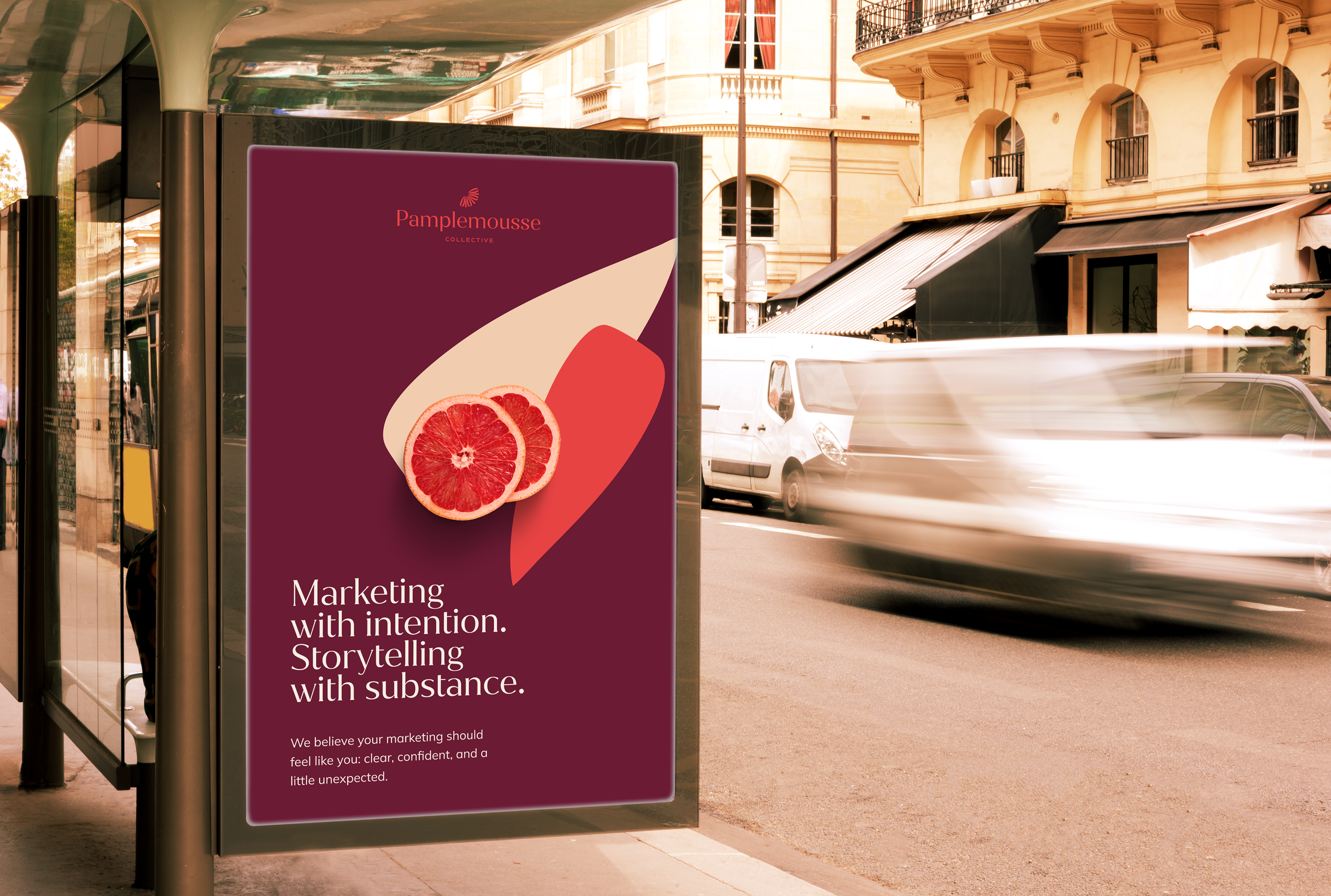
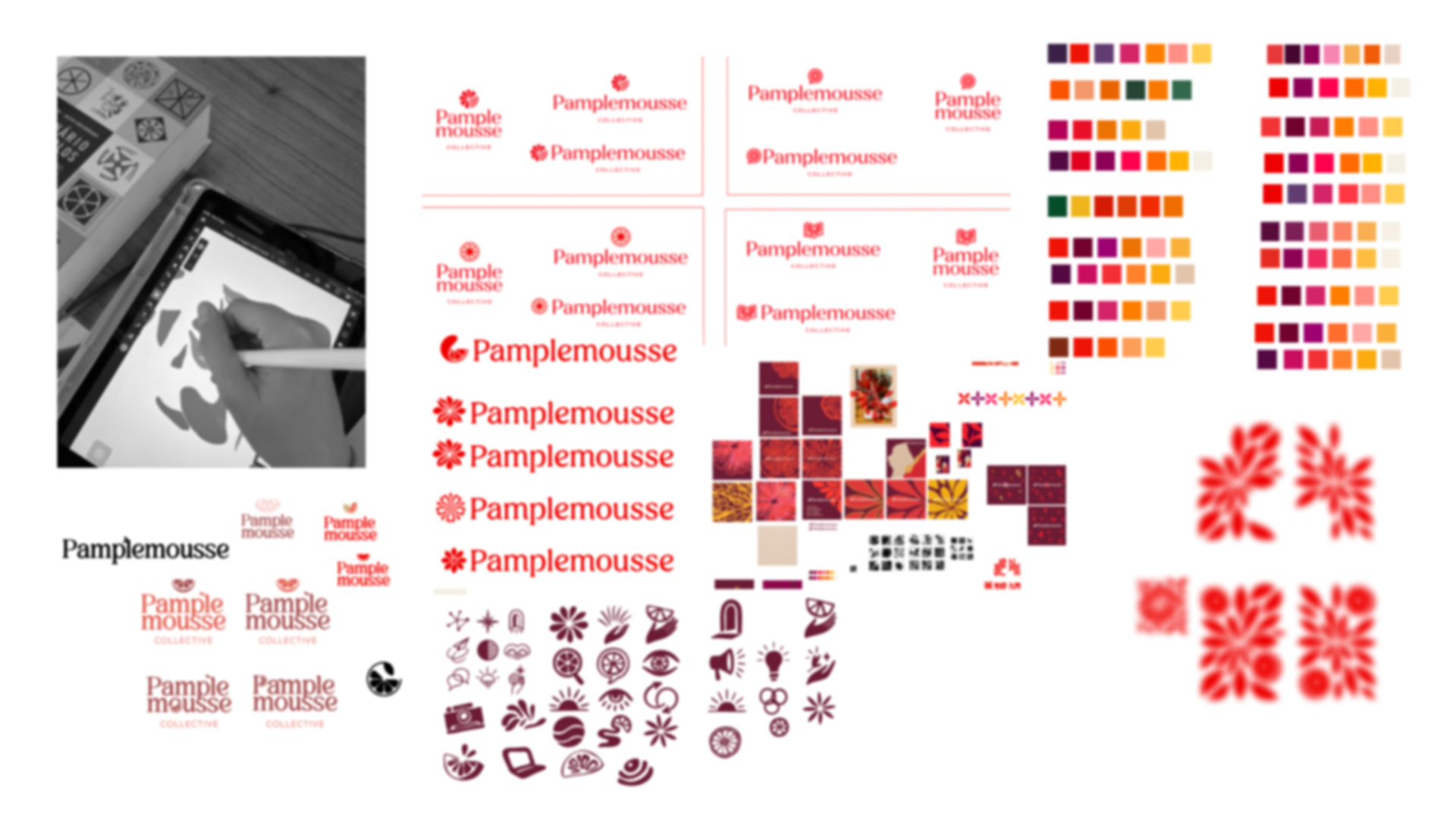
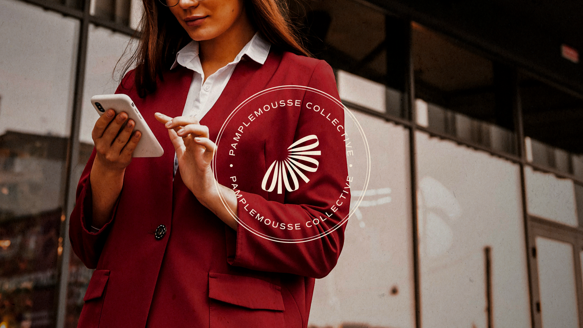
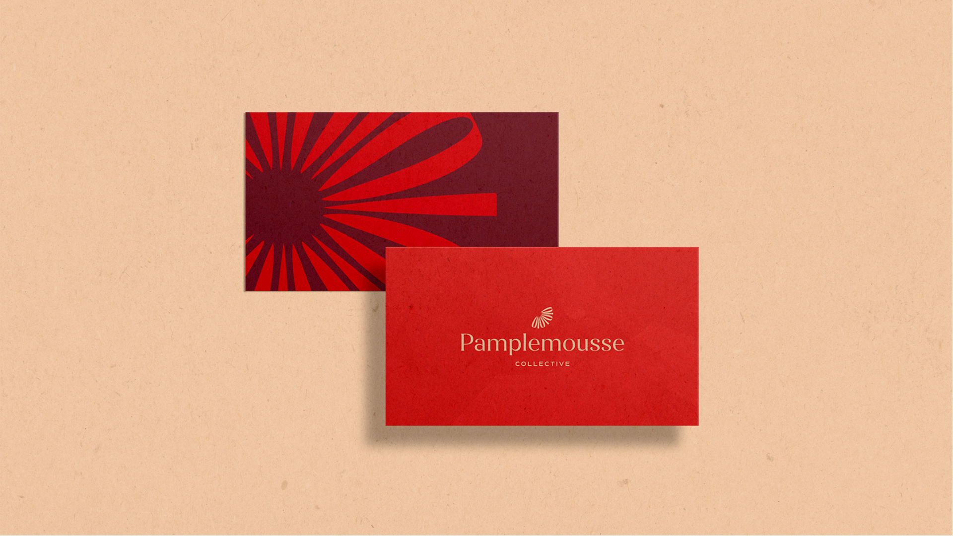
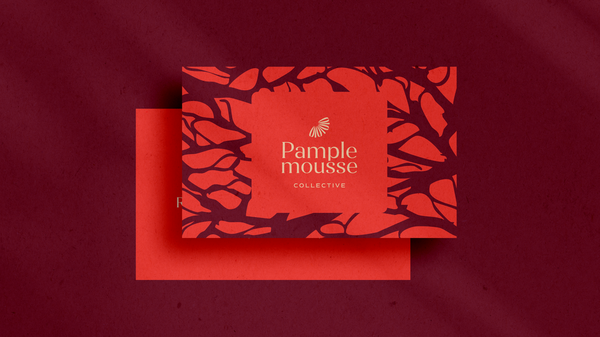
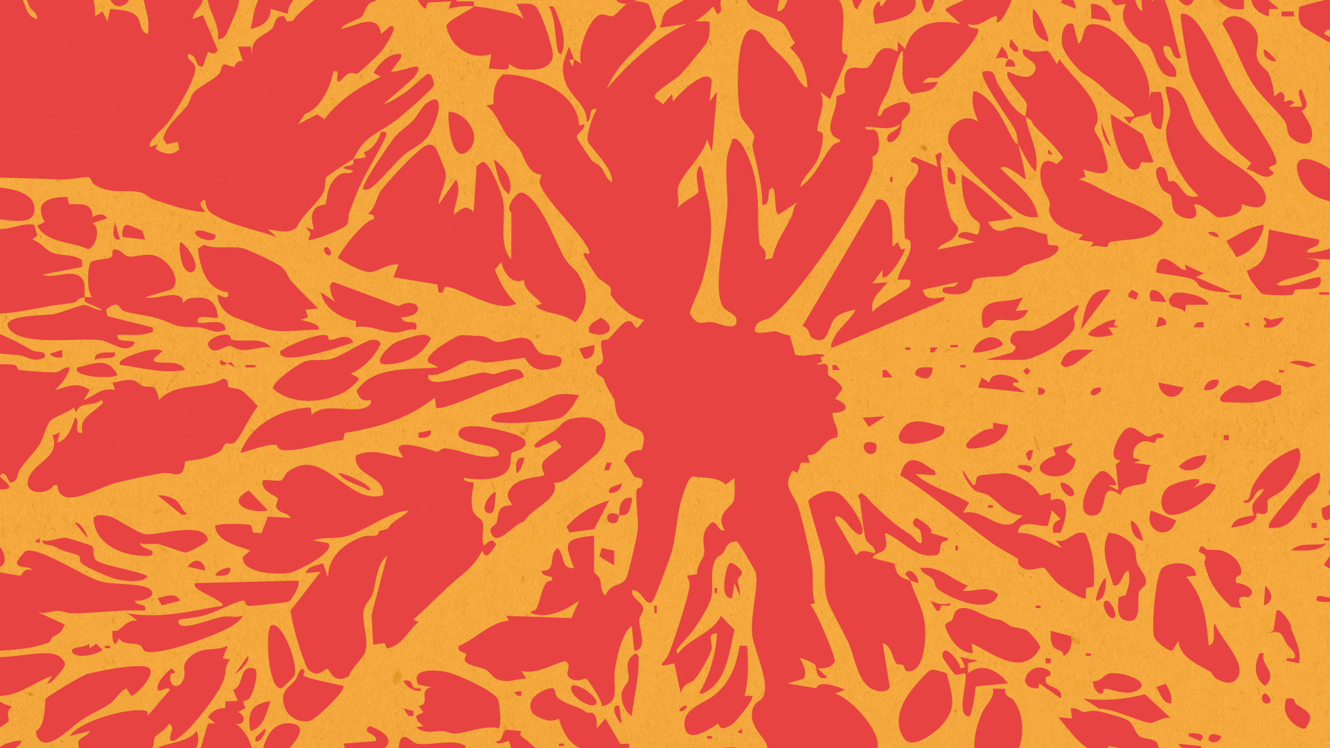
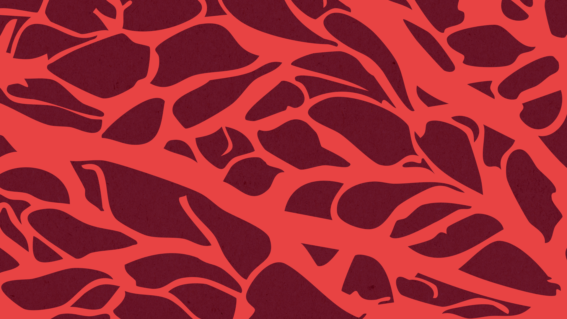
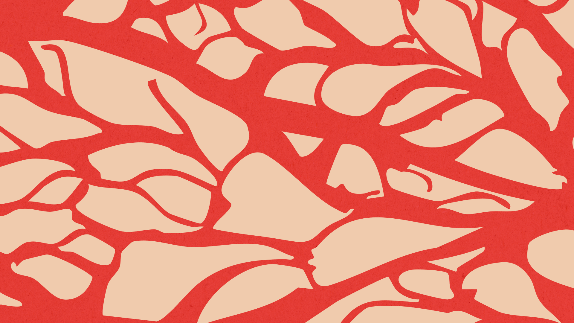
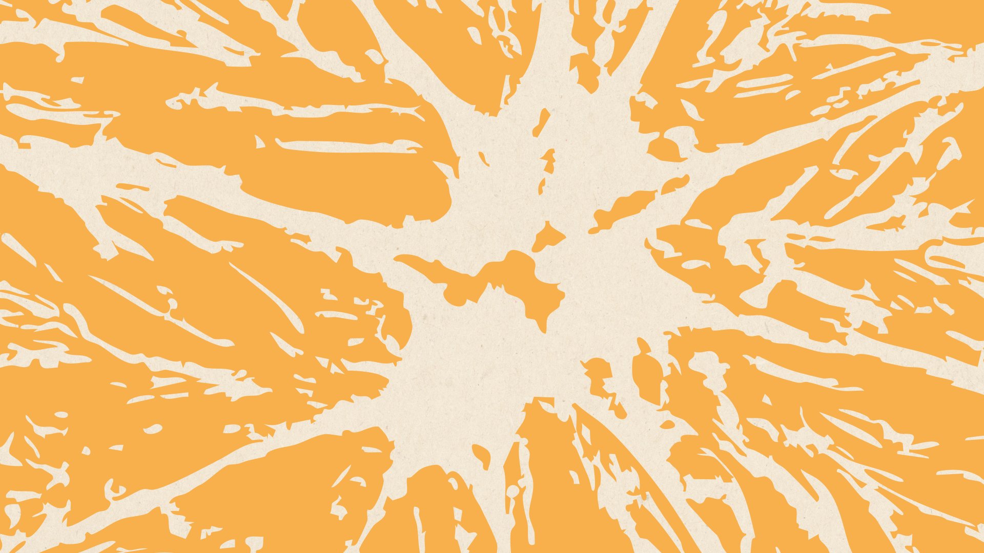
Instead of showing the fruit literally, we worked with abstract forms, segments that can read as petals, rays of light, or parts of a cycle. It’s a nod to the grapefruit, but it also suggests energy, movement, and strategy.

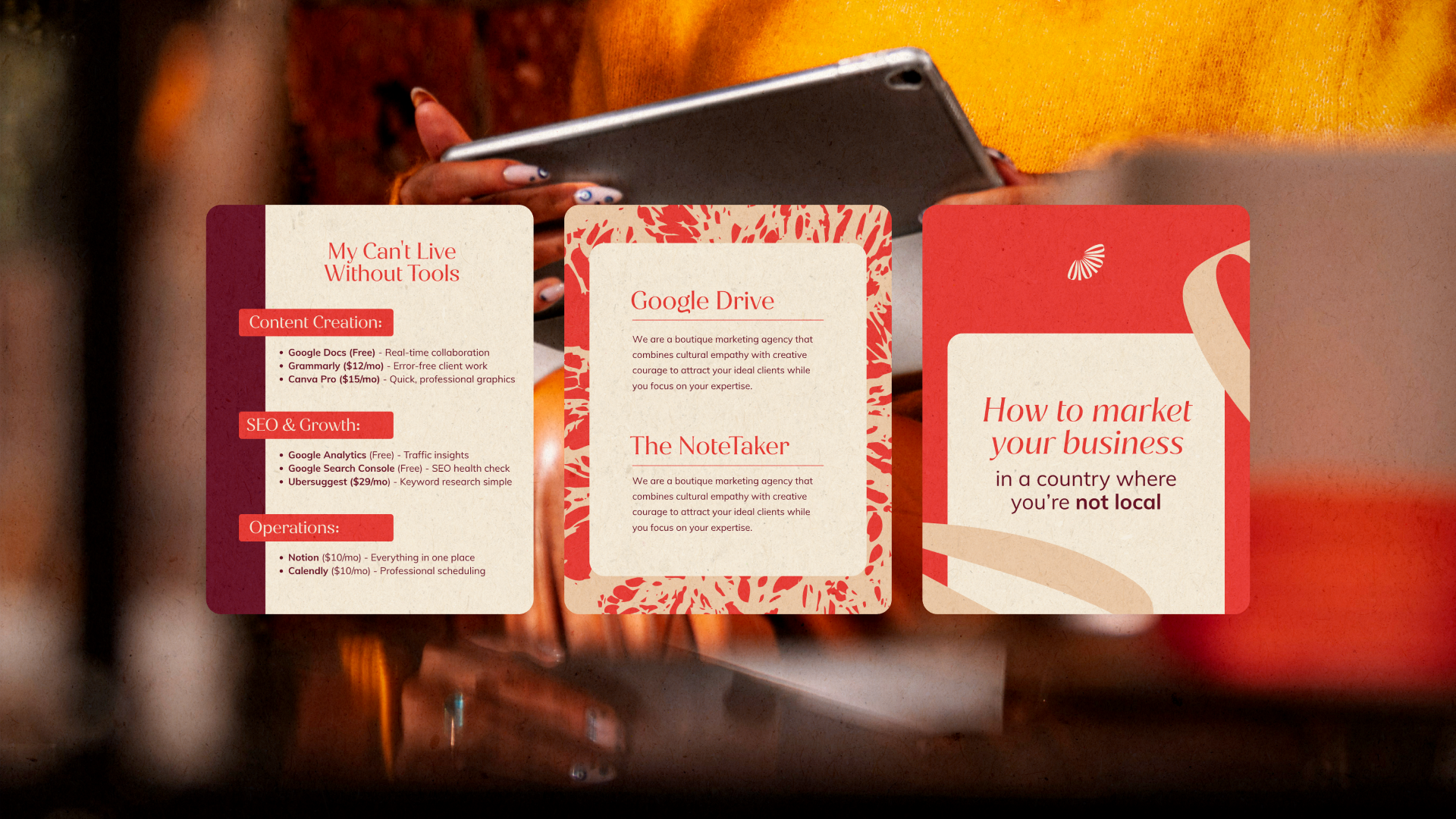
The graphic elements are a direct extension of the logo, by zooming in and breaking apart the grapefruit form, we created “petals” and “layers” that reflect the brand’s essence of nuance and depth.
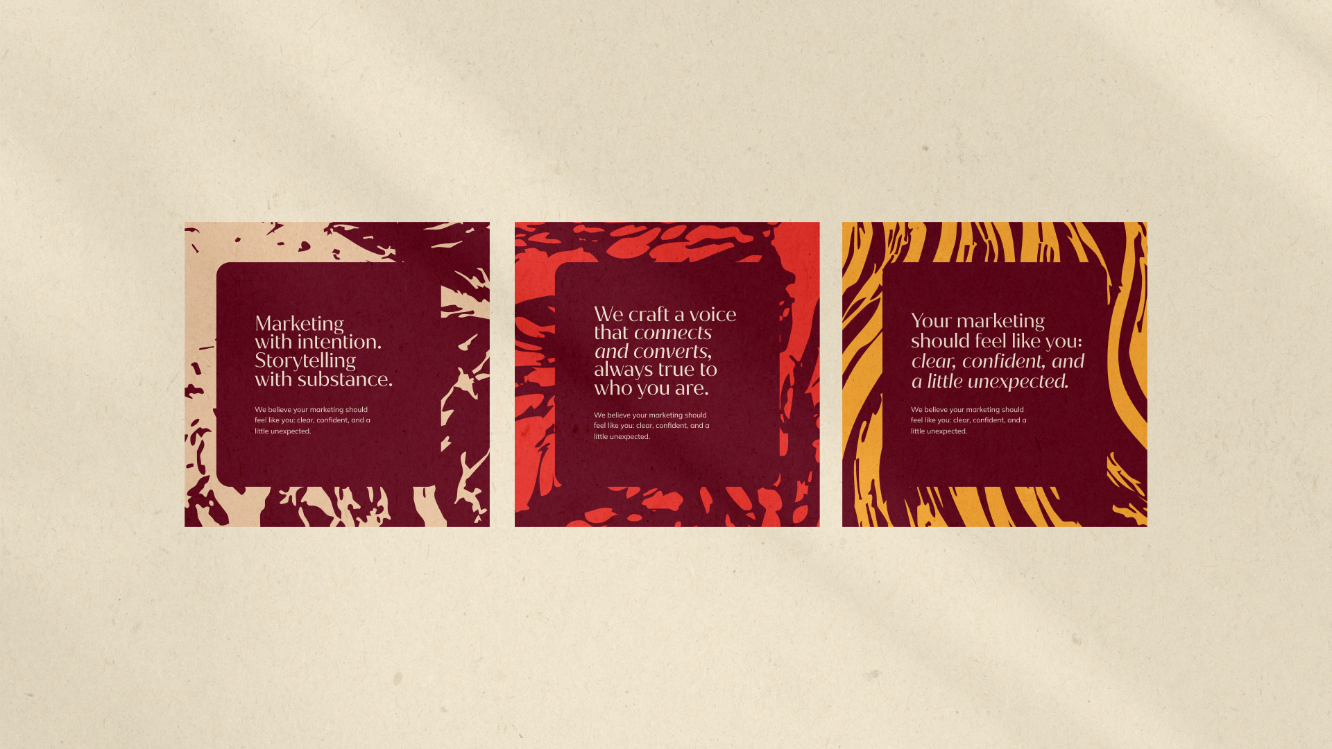
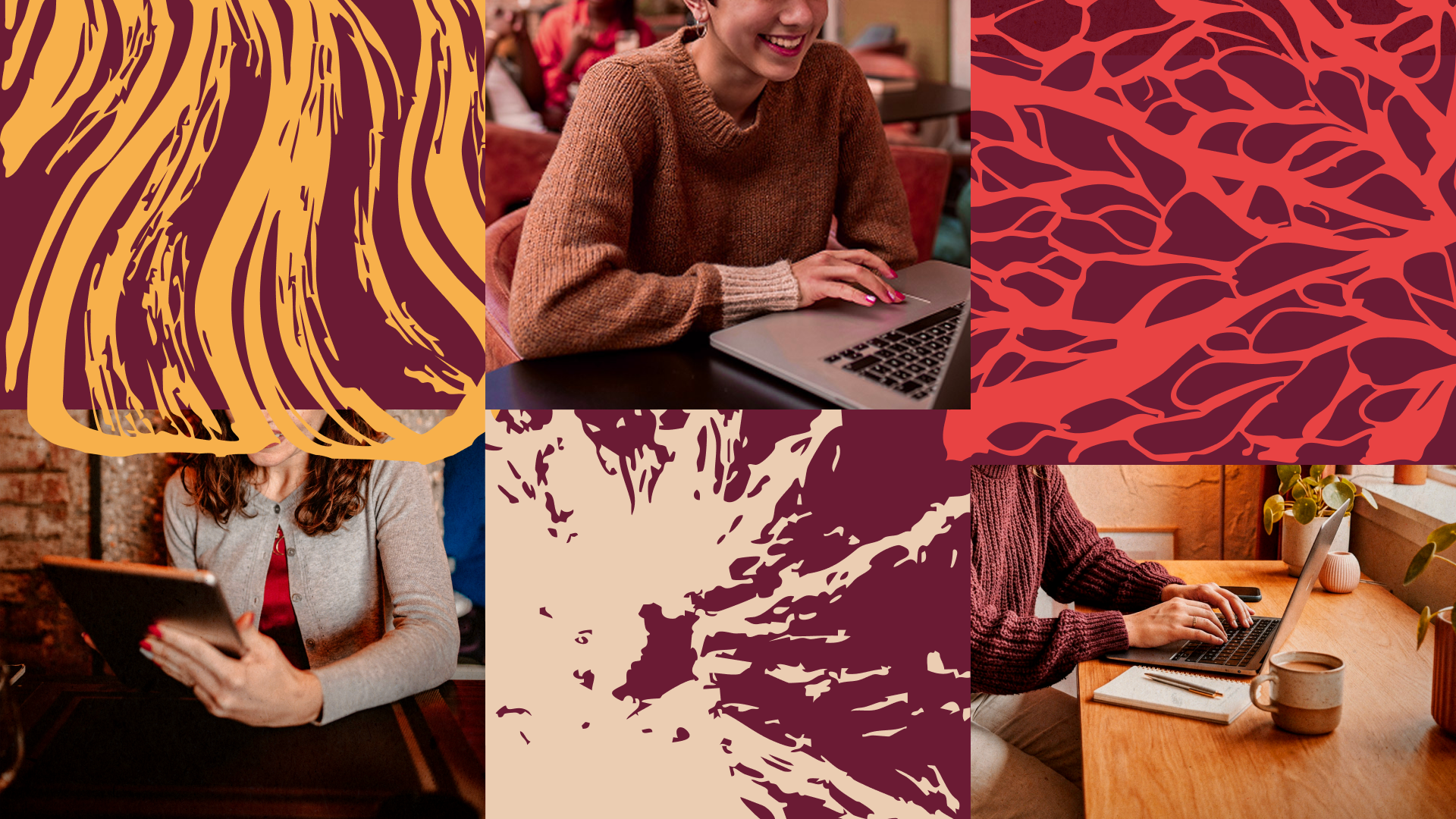
Each fragment acts as a metaphor for layered storytelling, showing how individual pieces come together to build something cohesive and intentional. The challenge was balancing creativity without tipping into overly feminine or playful territory, and the solution was bold, geometric forms arranged with control and refinement.
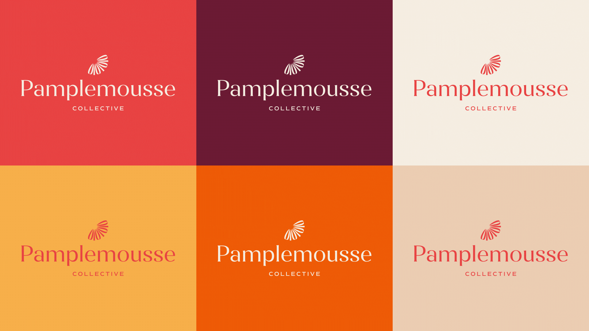
Combined with a grapefruit-inspired palette, these elements bring warmth and vibrancy in a way that feels professional, boutique, and sophisticated.
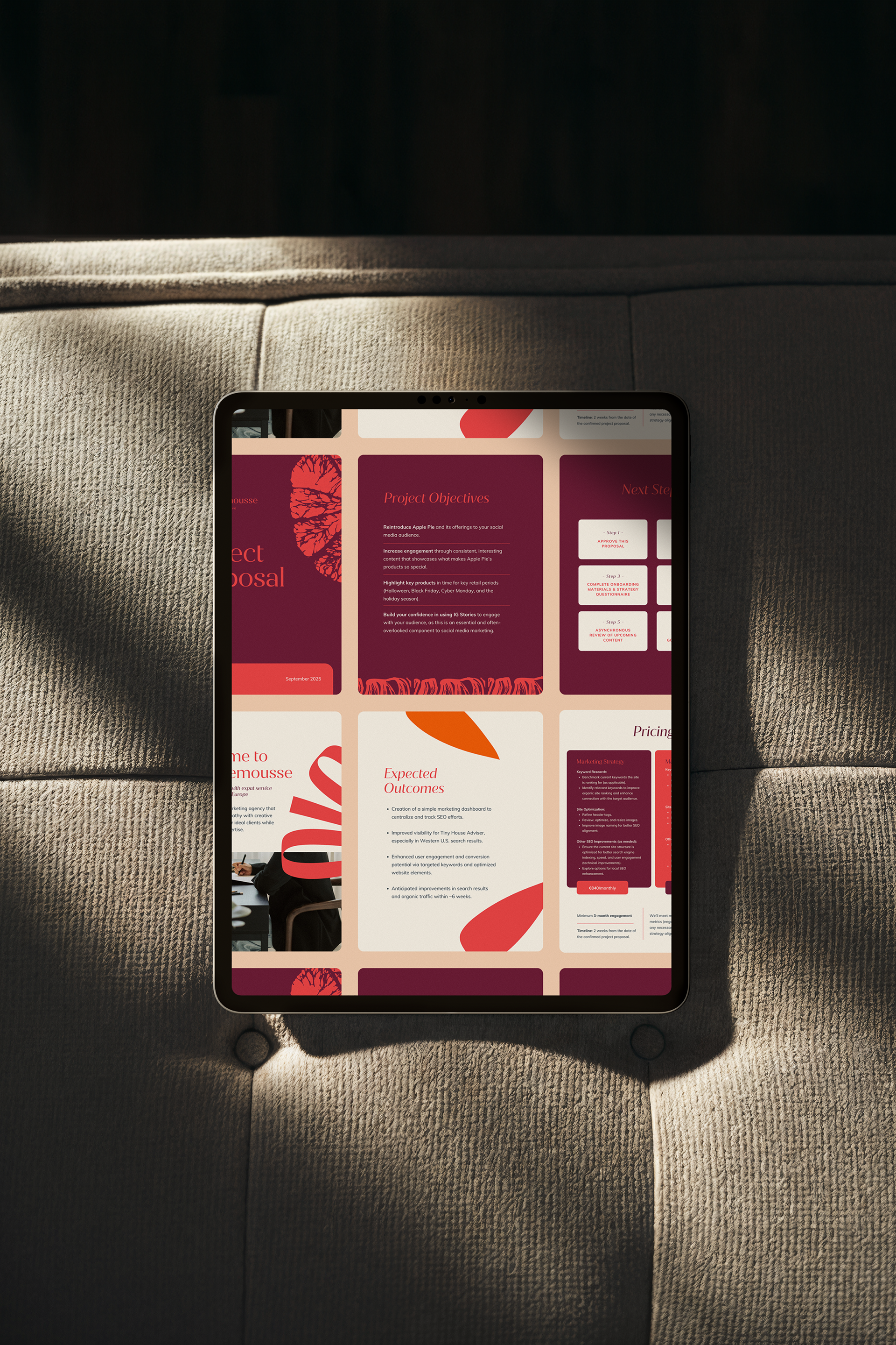
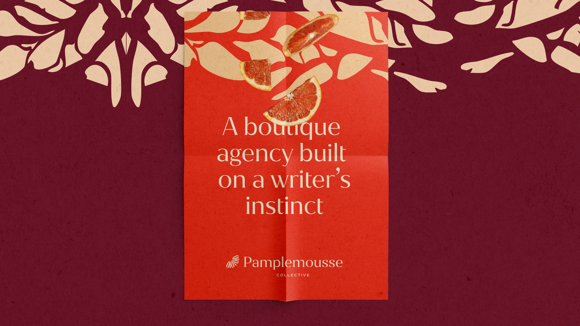
They serve as a flexible visual system that reinforces the identity across applications, dynamic over photography, textured in backgrounds, and unique as standalone graphics, giving Pamplemousse a ownable language that elevates it beyond the literal logo.
Each fragment acts as a metaphor for layered storytelling, showing how individual pieces come together to build something cohesive and intentional. The challenge was balancing creativity without tipping into overly feminine or playful territory, and the solution was bold, geometric forms arranged with control and refinement.
Combined with a grapefruit-inspired palette, these elements bring warmth and vibrancy in a way that feels professional, boutique, and sophisticated.
They serve as a flexible visual system that reinforces the identity across applications, dynamic over photography, textured in backgrounds, and unique as standalone graphics, giving Pamplemousse a ownable language that elevates it beyond the literal logo.

Client Love
"I first worked with Buenas while I was supporting a client -- that client needed a brand identity package and supporting assets, and we connected with Julia and her team to support. After seeing her work for my client and how organized, creative, and thoughtful the process was -- not to mention how happy the client was with the final work -- I knew I would return to work with her to create a brand identity for my company in the future. So I did, and I couldn't be happier with the result. Julia really takes the time to understand you, as the person behind your brand, and pushes you to understand your mission more deeply as a business owner. I've learned so much from Julia as it relates to thinking and working with brands. Just one key takeaway: It's not just about being happy with the colors or having a logo to put on a presentation; it's about being able to see yourself and your goals reflected in the final brand, and that is such a special feeling! Thank you so much to Julia and the Buenas Team!"
- Claire N.