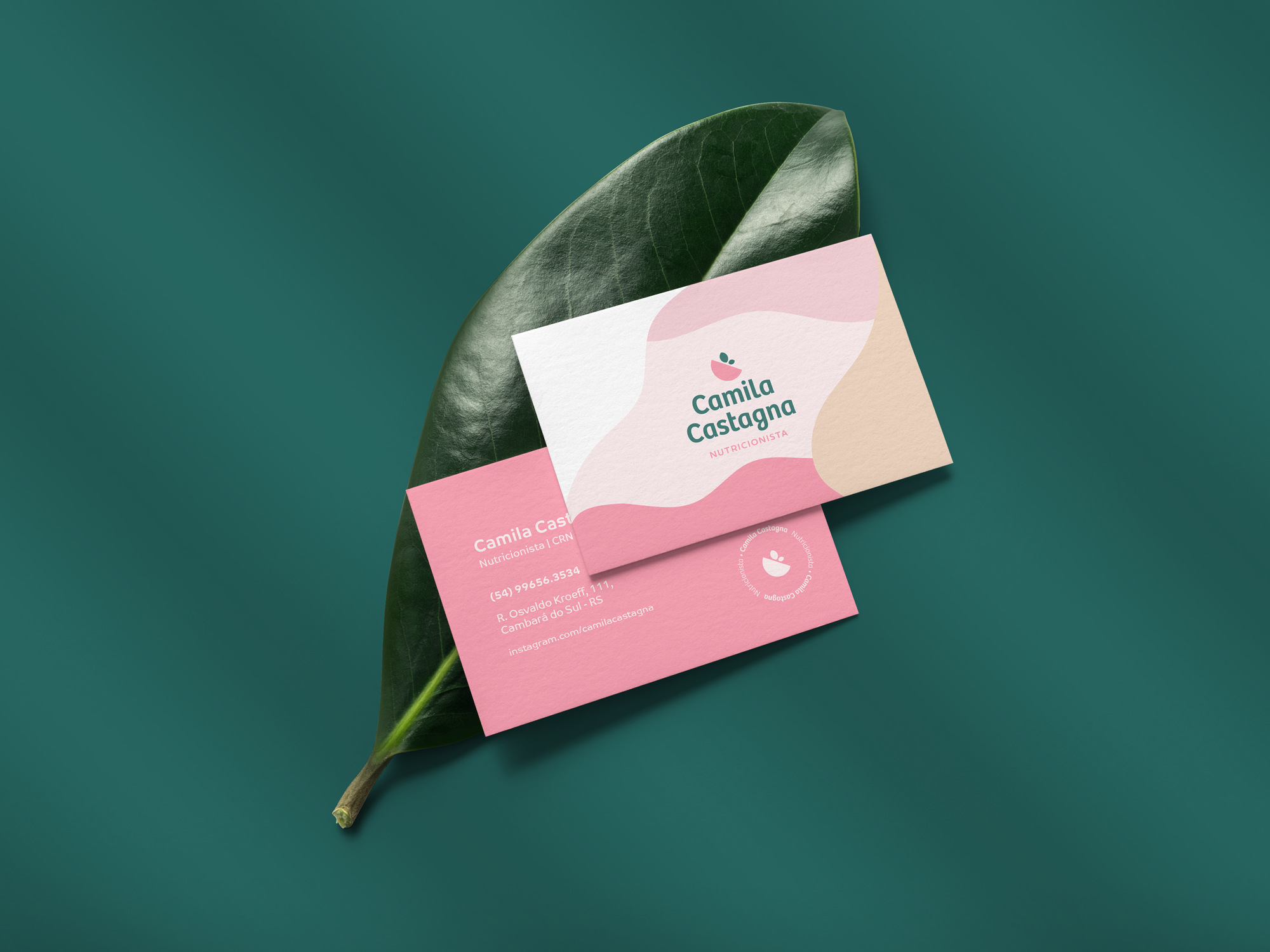
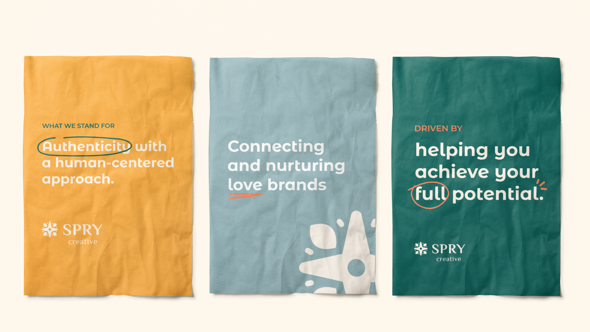
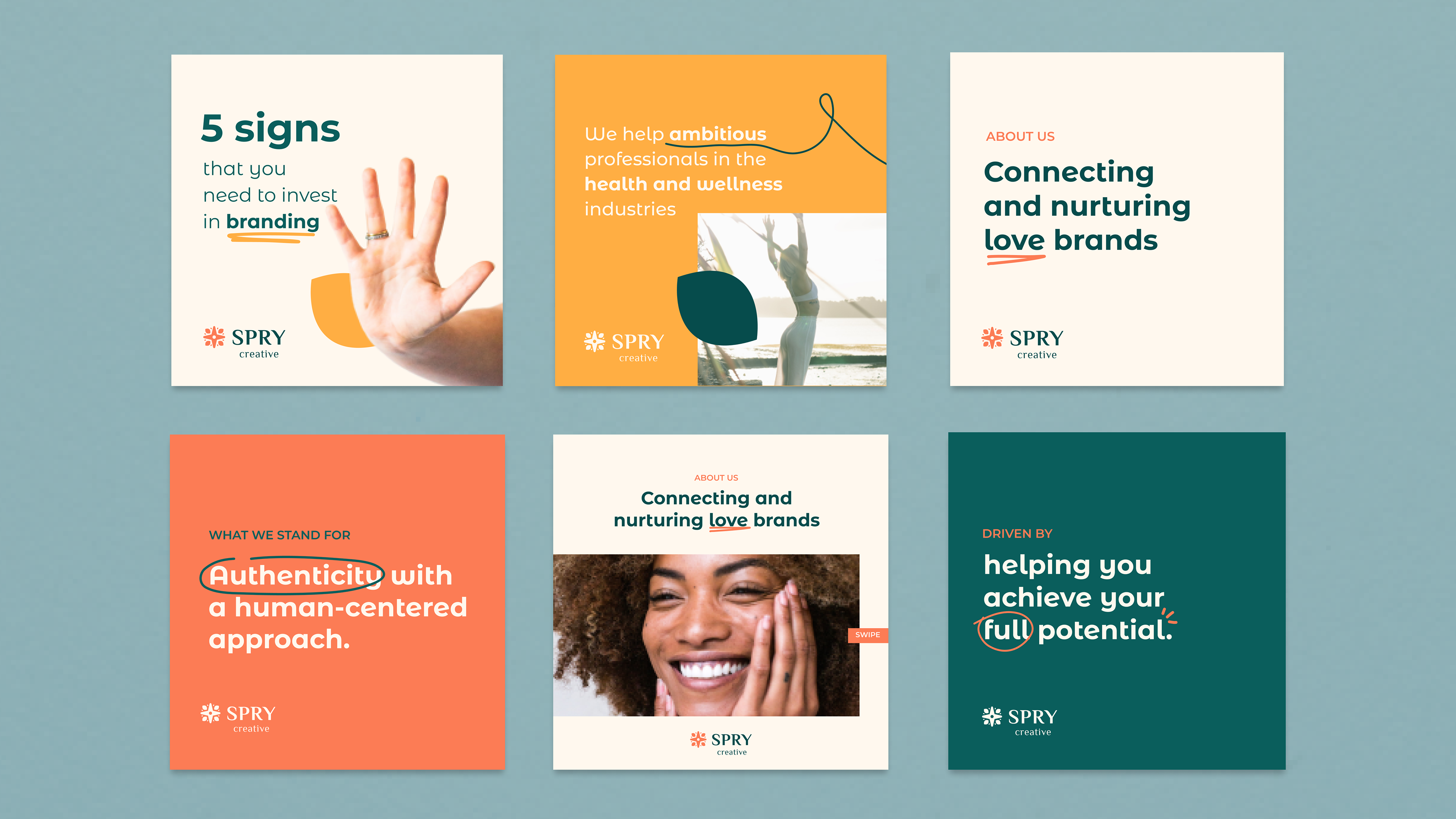
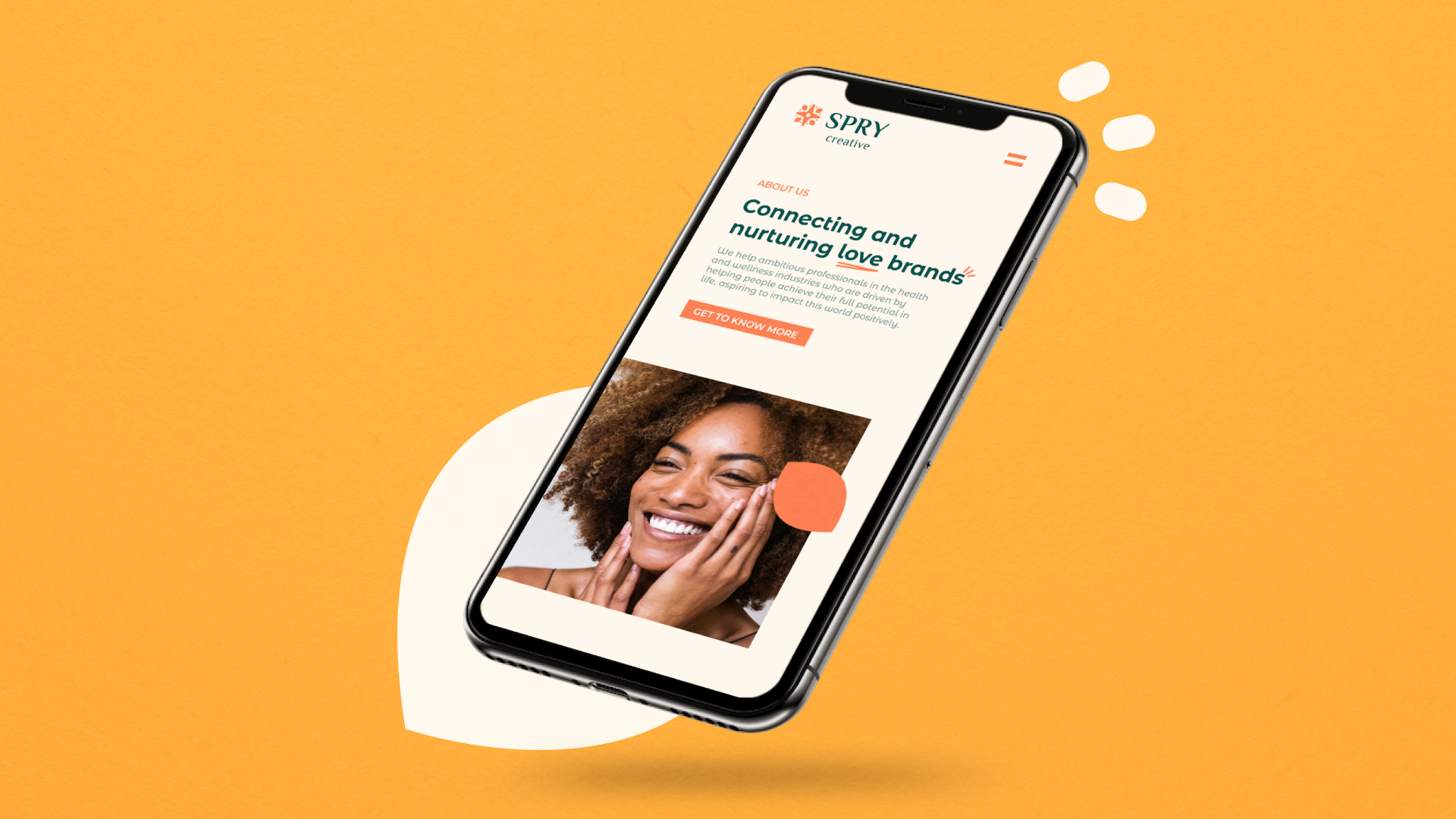
Spry Creative is a branding agency that helps ambitious professionals in the health and wellness industries who are driven by helping people achieve their full potential in life, aspiring to impact this world positively.
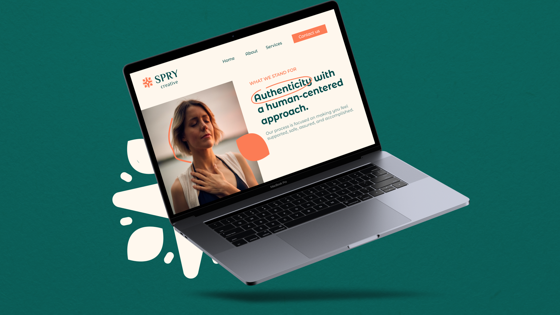
They stand for authenticity with a human-centered approach.
Their process is focused on making people feel supported, safe, assured, and accomplished. They understand the pains and challenges of the
people they serve; this is why they trust them as a guide.
people they serve; this is why they trust them as a guide.
They hold a strong belief that good branding should always put people first,
demonstrate honesty, caring, and support.

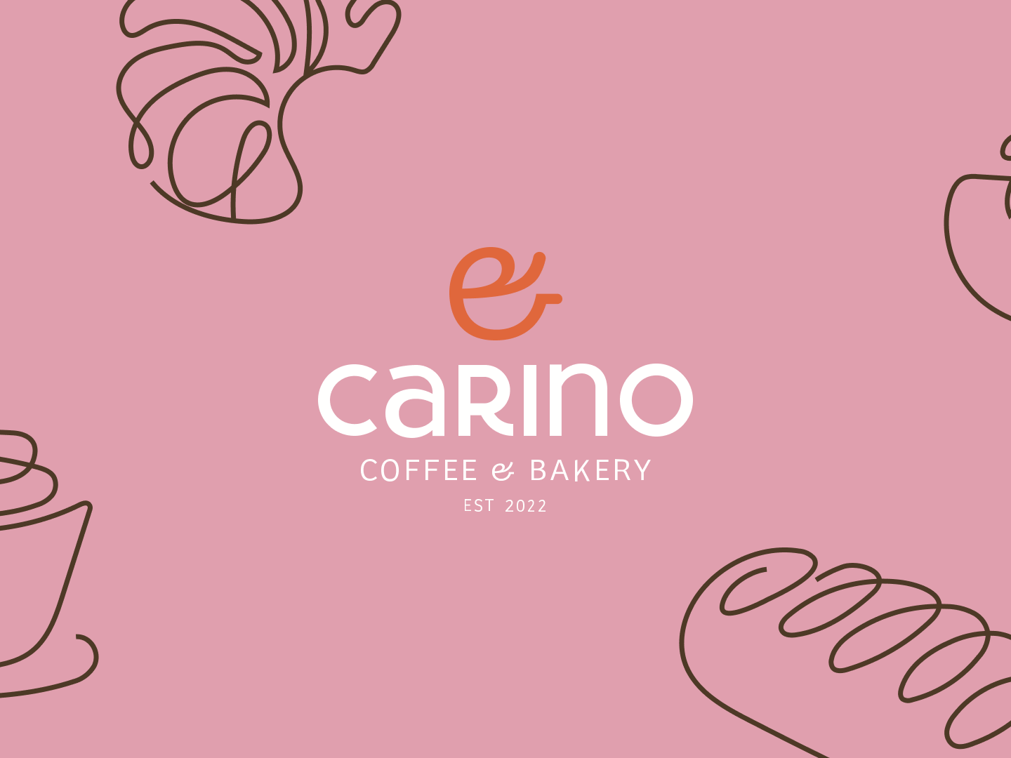
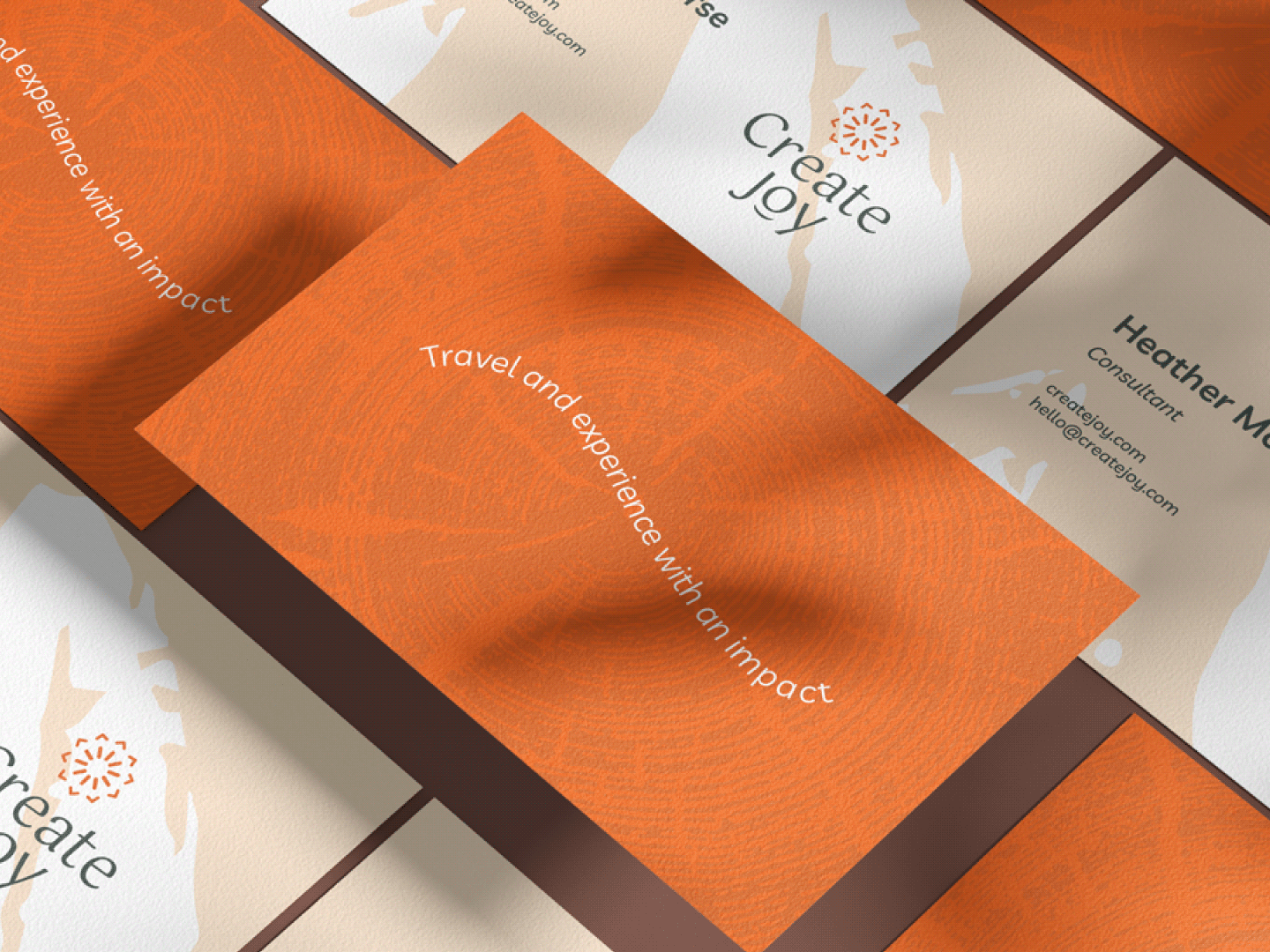
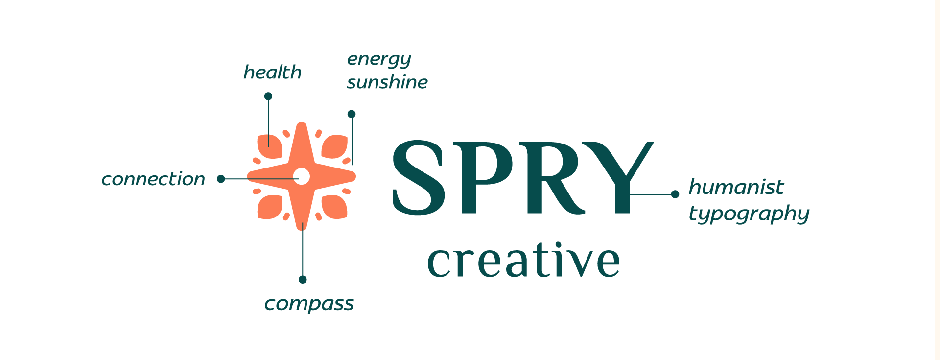
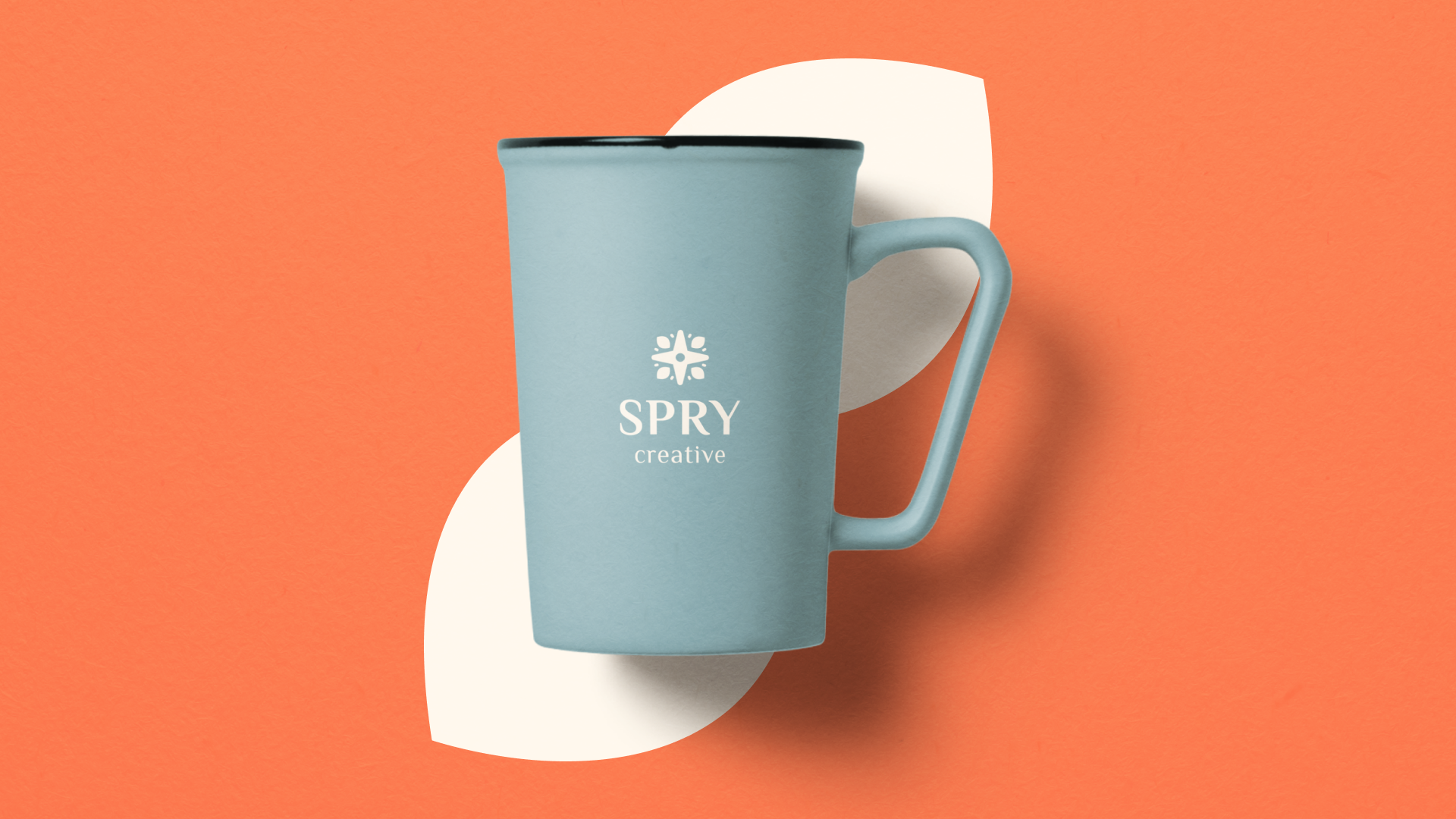
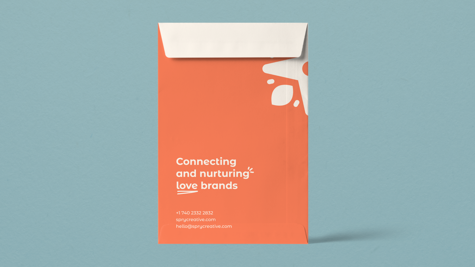
How chosen cores add a cheerful, energetic and light atmosphere.
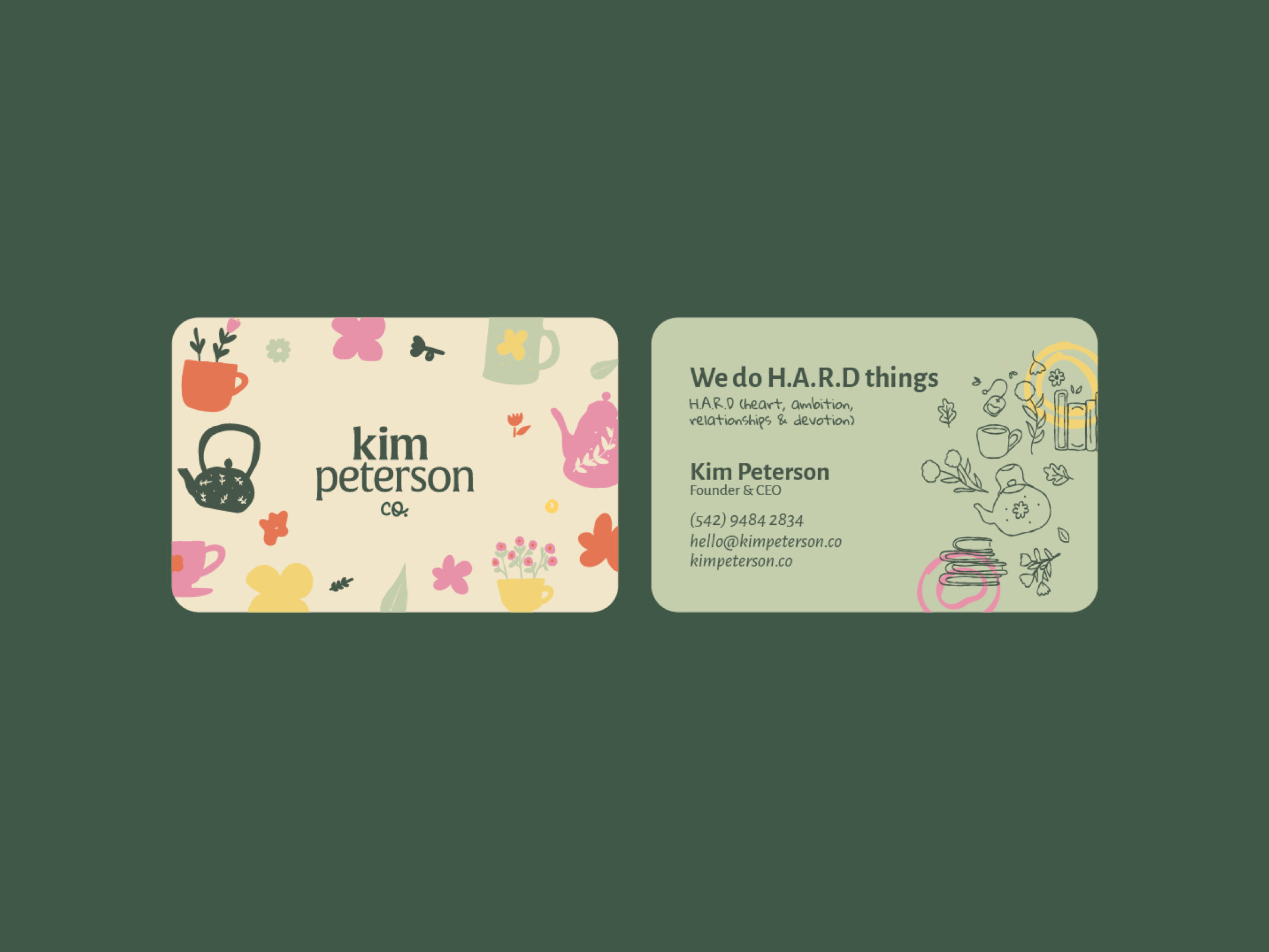
The orange along with the yellow, are the colors of joy, warmth, energy and transformation. Dark green, on the other hand, conveys health, well-being, balance, freshness, health and sobriety. Blue brings serenity. The beige conveys coziness and makes the combination of colors even more harmonious and pleasant.

Thanks!