
In a minimal, light and abstract way, we set out to convey in the logo:
- The process and continuity of a more balanced way of eating
- The bond between patient and nutritionist
- How involved she is with her patients
- The transformation that comes after nutritional re-education
- Love, which moves the world and also moves Talissa's work

The chosen colors add a cheerful, outgoing, light and cozy atmosphere that connects directly with the target audience.
Orange is the color of joy, warmth, energy and transformation.
Dark green brings calm, balance, freshness, well-being, health and serenity.
Brown brings balance, recalling the earth: organic and healthy.
The beige tone adds warmth and makes the palette even more harmonious and pleasant.

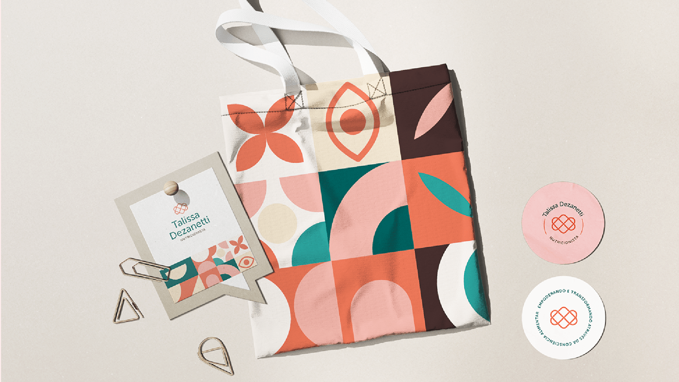
The geometric pattern brings a fun, cheerful and warm touch to the brand. In the elements, we set out to convey:
- Talissa's unique approach to nutrition
- Her patients' smiles of satisfaction
- The door that opens to change and new possibilities
- The flower, a symbol of nature, life, well-being, food and energy
- Transformation, connection, involvement, continuity, movement




Have a project like this coming up?
Start a Project