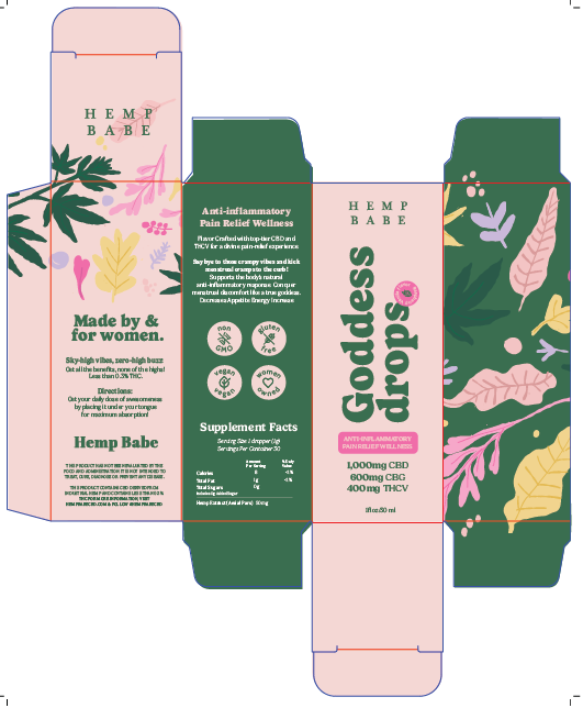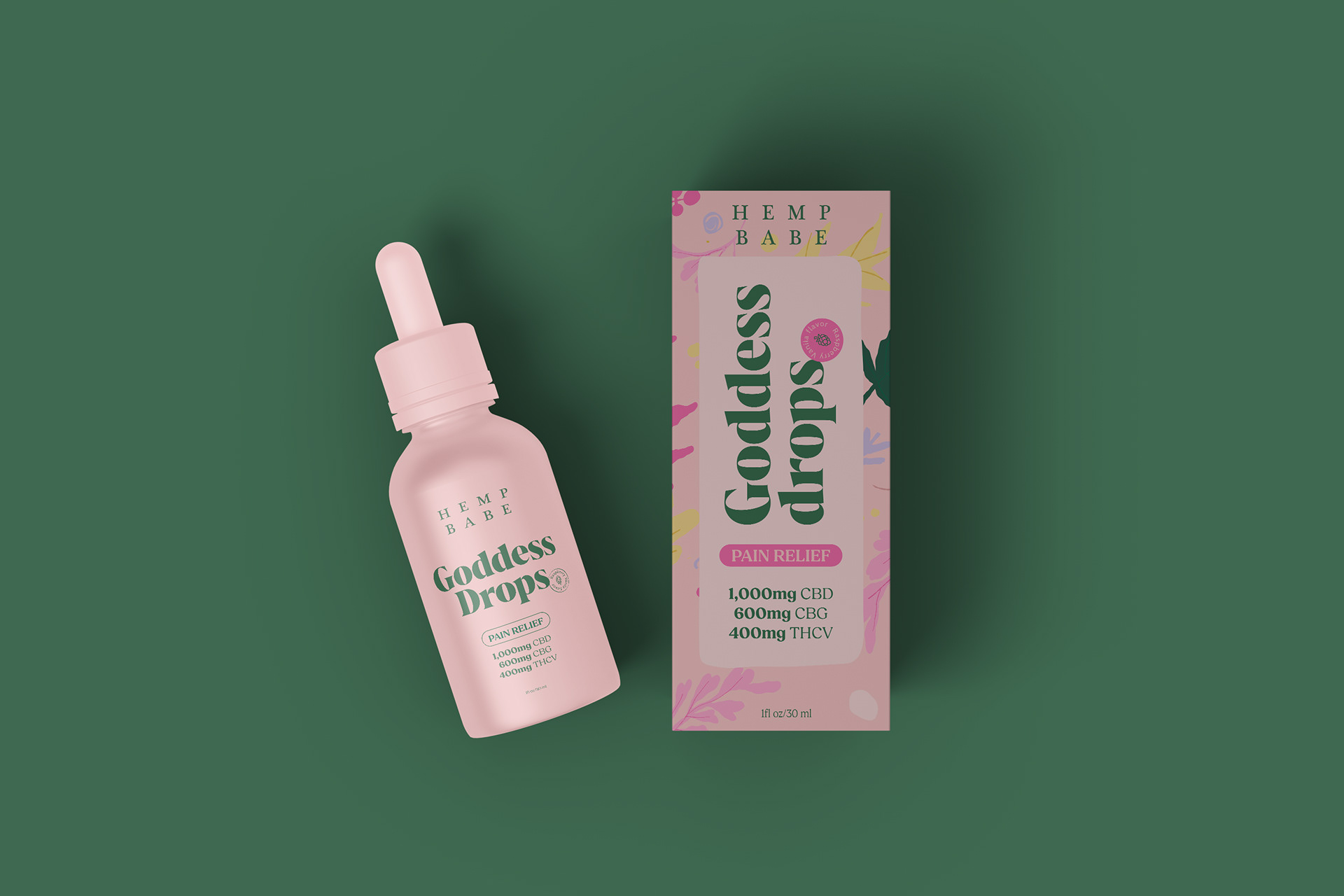
The creative direction was developed around a bold, playful, and fashion-forward “California girl” personalit, balancing vibrant self-expression with the quality and credibility expected from a premium wellness product. The packaging needed to communicate each product’s benefit clearly, celebrate the brand’s female-focused formulas, and feel distinctive enough to stand out both online and on dispensary shelves.
Three visual territories were explored: feminine and sophisticated, colorful and maximalist, and natural and wellness-led. This process established a clear foundation for a packaging system that feels approachable, memorable, and unapologetically made by and for women.
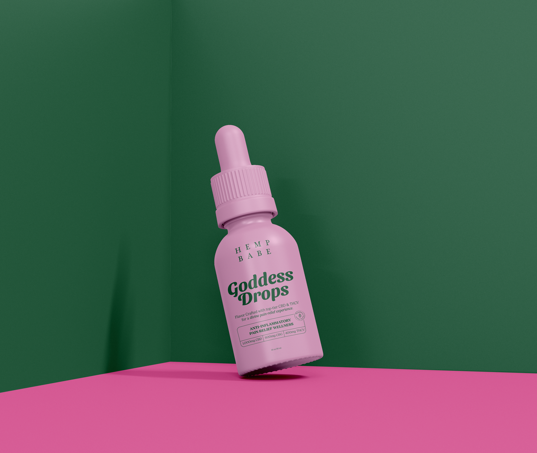
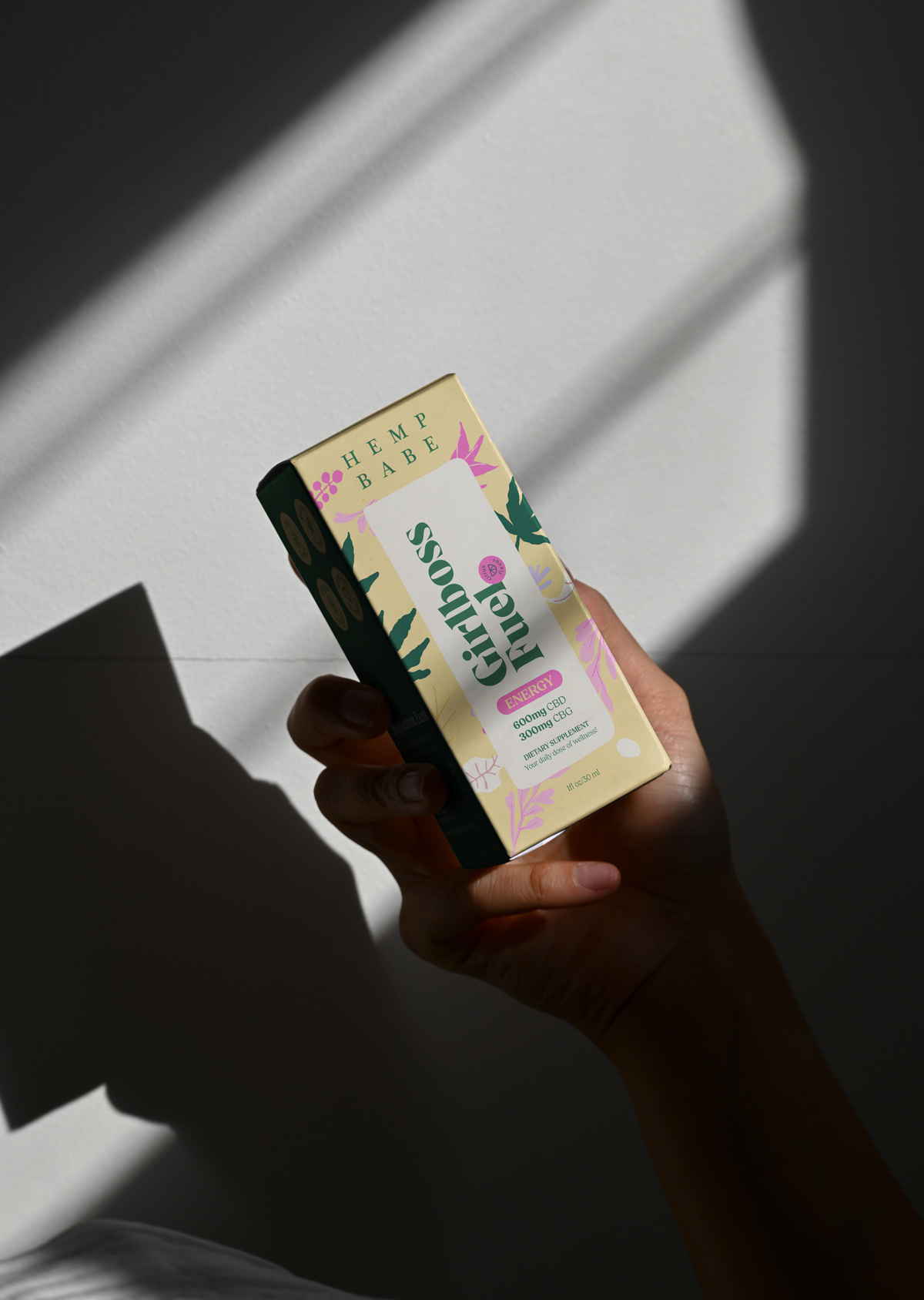
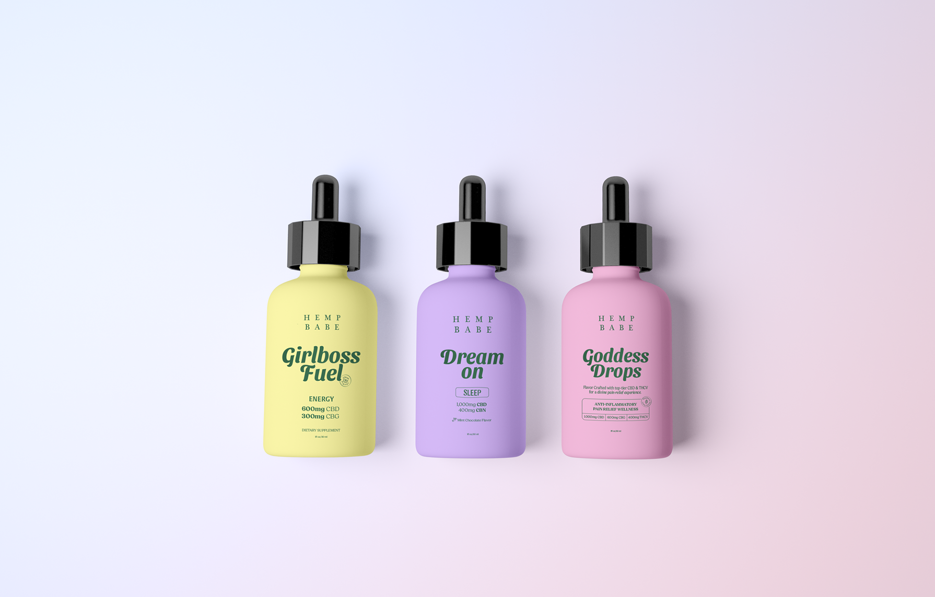
Different design concepts